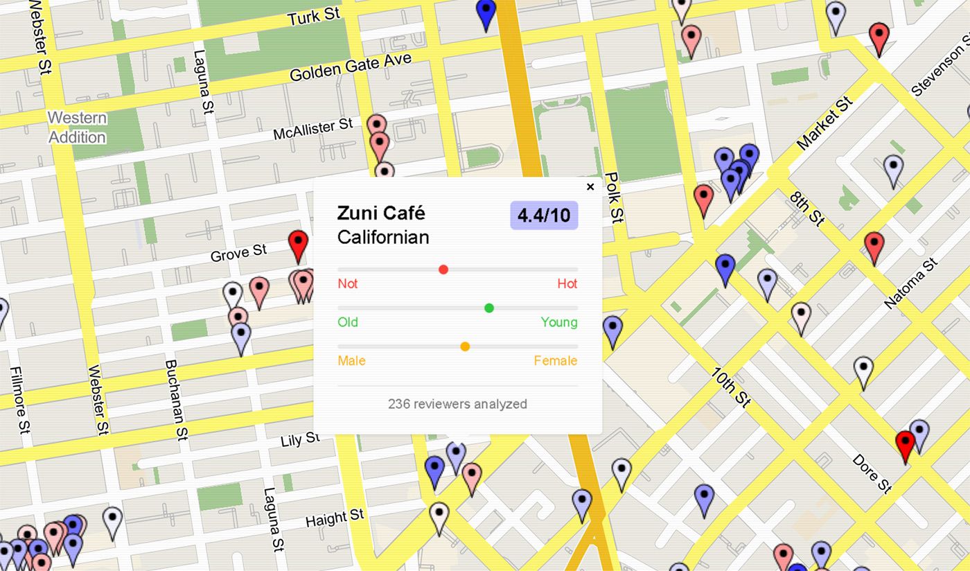
""I scraped millions of Google Maps restaurant reviews, and gave each reviewer's profile picture to an AI model that rates how hot they are out of 10," says San Francisco-based website creater Riley Walz. "This map shows how attractive each restaurant's clientele is. Red means hot, blue means not.""
"Walz, by the way, was profiled by Wired last year, and has been the mastermind behind a number of other entertaining and nostalgic-looking sites, including Bop Spotter, which picks up on every song it hears from a mystery microphone location in the Mission District, using Shazam 24/7."
"Walz admits, regarding LooksMapping, "The model is certainly biased. It's certainly flawed," and how could it not be? But he's created a methodology document that explains how the AI model ranks users, giving them "unattrativeness" and "attractiveness" scores though I'm still not clear on what the model is doing here. And this is all highly dependent on how many Google reviews a restaurant has, and how many of those reviewers had photos of themselves attached to those reviews."
The LooksMapping site scrapes millions of Google Maps restaurant reviews and evaluates reviewers' profile pictures with an AI model that assigns attractiveness scores on a 1–10 scale. The site aggregates those scores to display restaurant-level 'hot or not' maps where red indicates hotter clientele and blue indicates not. The ranking depends heavily on how many reviews include profile photos and the sample of reviewers per restaurant. The AI model and methodology are acknowledged as biased and flawed, and the results include unexpected top-ranked venues and questionable low scores for well-known spots.
Read at sfist.com
Unable to calculate read time
Collection
[
|
...
]