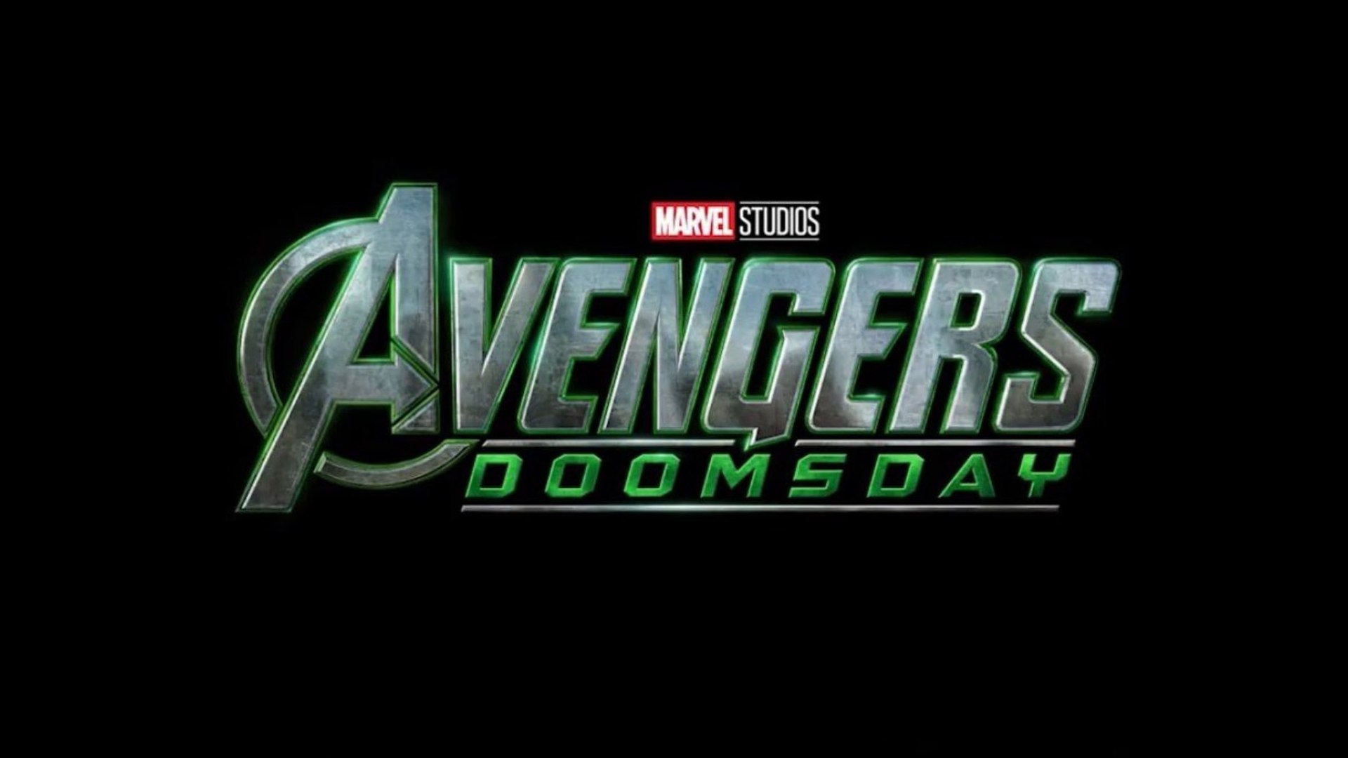
"A new logo for Avengers Doomsday has divided the fandom after its debut at the recent D23 conference. Since its announcement back in 2024, we've seen a handful of logo designs, but it seems fans can't decide which is their favourite. Set to release seven years on from the explosive success of Avengers: Endgame, Marvel clearly has some high expectations to meet with Doomsday."
"The new Avengers: Doomsday logo can be summed up in one word - green. It appears to be similar in design to an official logo released back in 2024, with the iconic Avengers logo depicted in a grungy silver metal. Bordering the design is a bright green glow, with 'DOOMSDAY' presented in a similar vivid green - small but mighty changes that give the design a dynamic energy."
""So Loki coded," one fan claimed on X, while another chimed in that the "New one is 10x better!". However, not all fans shared the same praise, with one writing "Eh, they need to stop revealing logos just to change it to one that's not better than the original." Others were also unconvinced with one fan adding, "New logo is so lame who made that decision it's horrendous" while another theorised "Doomsday logo is changing in every 3-6 months... 2-3 new logo's to come.""
A new Avengers: Doomsday logo debuted at the D23 conference and divided the fandom. The design mirrors a 2024 logo with the Avengers emblem in grungy silver metal, surrounded by a bright green glow and vivid green 'DOOMSDAY' text. Small alterations create a more dynamic energy but prompted polarized responses across social media, with some fans praising the change and others calling it lame or unnecessary. Several fans speculated that the logo could be revised multiple times before the film's release. The film is scheduled for May 2026, arriving seven years after Avengers: Endgame.
Read at Creative Bloq
Unable to calculate read time
Collection
[
|
...
]