"Every creative decision was informed by the tension of utility and luxury. We had to make sure the logo, collaboration lockups and type system were future-proofed and adaptable enough to apply to future collections. That thinking extends to the typography. Tracked-out Gothic sans lettering and bold numerals give edition numbers a quiet authority."
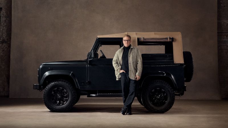
"In the car industry, luxury is often presented as shiny, bright lights and perfectly retouched photography to the point of reading CGI. We intentionally chose a more authentic approach, shooting the car in a Brooklyn warehouse with industrial bones left exposed, rejecting the usual automotive playbook of pristine studio floors and hyper-polished imagery."
Todd Snyder and Balmoral Defender launched Edition 001: City Black, a collaboration that moves beyond typical fashion-automotive partnerships by treating the designer as a creative author rather than an endorser. MLTI NYC developed a comprehensive brand identity system centered on the concept of "ruggedly refined," combining British restoration craft with American tailoring. The identity features a dual logo system with a contemporary sans-serif wordmark and nostalgic script logo. The design system was intentionally future-proofed to accommodate planned subsequent designer collaborations. Typography uses tracked-out Gothic sans lettering and bold numerals to convey limited-edition authority. Photography and film departed from industry conventions, shot in a raw Brooklyn warehouse rather than pristine studios, emphasizing authentic luxury over hyper-polished presentation.
#fashion-automotive-collaboration #brand-identity-design #luxury-positioning #limited-edition-strategy #creative-direction
Read at Creative Boom
Unable to calculate read time
Collection
[
|
...
]