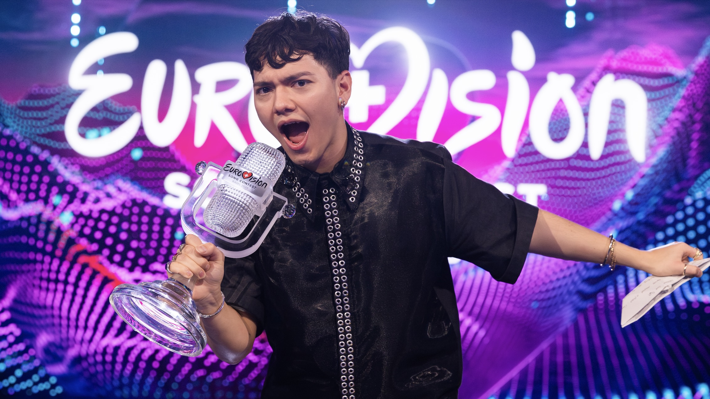
The Eurovision Song Contest has introduced a new logo for its 70th anniversary, departing from its traditional script to a lowercase, rounded font. Central to the design is a heart in place of the 'v', symbolizing unity and love for music, complemented by the 'Chameleon Heart' within the ‘0’ to signify each year of the contest. Responses from fans vary widely, with some expressing criticism over the design choices, while others show support for the celebration of Eurovision's rich history in music and diversity.
"Eurovision has decided to celebrate its 70th anniversary with a new logo, featuring an all-lowercase, rounded font and a heart at its center."
"The new logo incorporates a 'Chameleon Heart' in the '0', symbolizing 70 layers to represent each year of the Eurovision Song Contest."
"Some fans criticized the new design, comparing it to Canva/AI and expressing disappointment over the changes made for the anniversary."
Read at PinkNews | Latest lesbian, gay, bi and trans news | LGBTQ+ news
Unable to calculate read time
Collection
[
|
...
]