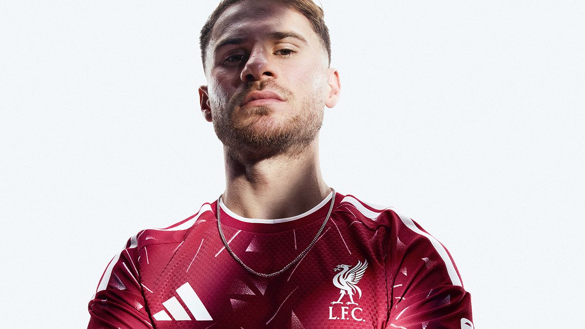
Liverpool’s 2026/27 home kit from Adidas draws inspiration from the club’s 1989 to 1991 era, including the 1989/90 First Division title. The design revives jagged, faded triangles, but the updated version makes the pattern more prominent with clearer white lines and triangle shapes that more directly reference the original. Adidas adds visual interest by incorporating triangle elements that suggest the Adidas logo. The kit uses a slightly darker red to balance the increased white presence, creating a look that can resemble early 2000s Reebok styles. Lighting can affect how distinctly the kit reads as Liverpool. A green goalkeeper version follows a similar theme.
"The kit is a modern take on the kit that Liverpool wore from 1989 to 1991, including the Reds' 18th title win in 1989/90. That made it the last home kit of Liverpool's golden era that had extended back nearly 20 years into the early 1970s - and it would be another three decades before Liverpool finally got their hands on the top-flight trophy once again."
"The original kit featured jagged, faded triangles that only really turned white at the very tips, but the pattern on the 2026/27 effort demands to be seen much more loudly. Those triangles are back again, not-so-subtly suggesting the adidas logo at points, and are joined by some rather jazzy, very clear white lines."
"We suspect that may be divisive: some fans might like that adidas have found a way to bring a bit more visual interest to a kit that doesn't typically offer much room for interpretation. Others might feel like it looks like a child's duvet cover from the 1990s."
"Adidas have tried to balance out having more white than usual on the kit by using a slightly darker shade of red than usual, which makes it feel a bit more like some of Reebok's early 2000s efforts than anything else. Lighting is a factor, however: in many lights, it is unmistakably Liverpool."
Read at www.fourfourtwo.com
Unable to calculate read time
Collection
[
|
...
]