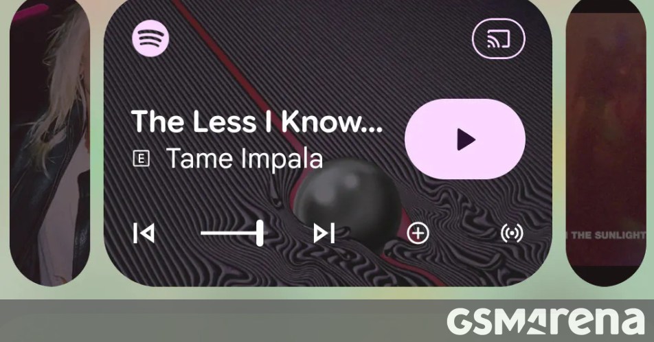
Android 17 QPR1 Beta 3 introduces UI changes to the media app switcher in the notification shade. The previous carousel required swiping left and right to move between active media apps. The new interface minimizes other media apps into tiny cards and expands a card when tapped. This approach reduces the chance of switching mistakes and makes it more obvious that users can switch between media apps immediately, which can help new users. The minimized audio apps occupy more space, which makes the active music app tab smaller and reduces the size of player controls. As a beta prototype, the switcher may change before stable Android 17 release.
"While Android 16's current media app switcher that shows up in the notification shade requires you to swipe left and right to switch between active media apps, Android 17 will bring a new, more convenient and obvious switching style."
"In the new UI, Android minimizes the other media apps into tiny cards that expand when you tap on them. This makes it not just more convenient and minimizes the possibility of a mistake, it also makes it a lot more obvious, especially for new users, to see that they can switch between media apps on the fly."
"On the other hand, the minimized audio apps take up more space, forcing the active music app tab to become smaller and consequently smaller player controls. But that's what beta versions are for. It's a working prototype, but we might see changes to the media player switcher before the stable Android 17 hits the market."
Read at GSMArena.com
Unable to calculate read time
Collection
[
|
...
]