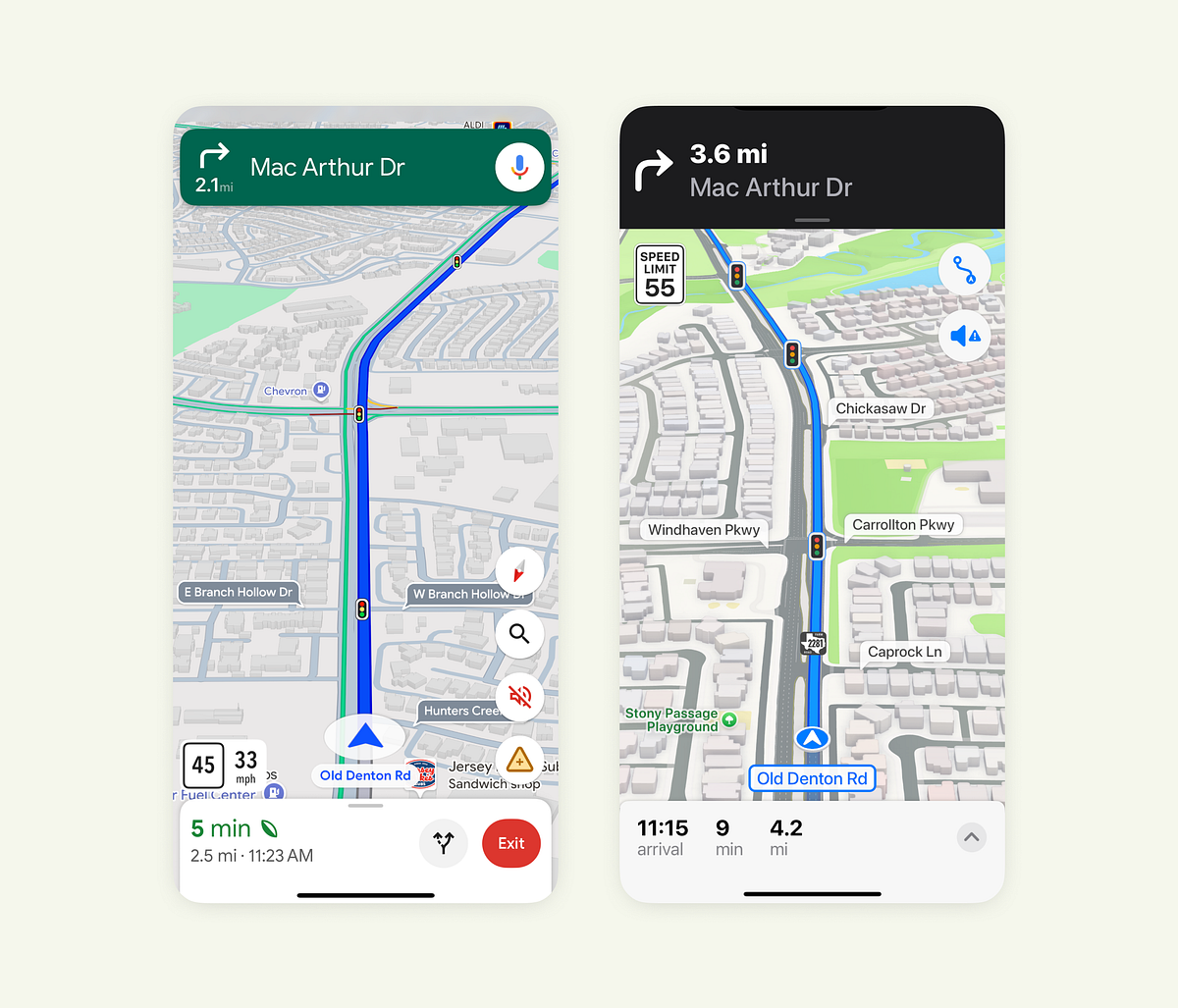
Navigation apps rely on many small design decisions to shape driving behavior, attention, and user confidence. Google Maps favors information density and immediate action by placing live speed and speed limits near the route and highlighting violations for quick awareness. Apple Maps emphasizes clarity and visual harmony by positioning speed limits near upcoming maneuvers and using familiar sign-like icons for recognition. Google’s bottom bar aggregates distance, time, ETA, and eco-driving cues with varied colors and typography for rapid scanning. Apple’s bottom bar remains minimal and typographically consistent to reduce clutter and promote calm focus.
"In Google Maps, the speed limit sits close to your current location and route line, exactly where your eyes naturally go when driving. The app also shows your live speed, and when you exceed the limit, it highlights the change to draw attention. This design helps users stay aware without shifting focus from the road. Apple Maps places the speed limit near the top, just below the next navigation step."
"Both designs have logic behind them. Google focuses on at-a-glance awareness, while Apple leans on familiarity and visual consistency. Google's bottom bar carries a lot of weight. It shows distance, time, ETA, and sometimes even eco-driving info. The mix of colors, typography sizes, and icons helps users scan information quickly. But it can also feel dense, especially in bright environments or when you just want to focus on the route."
Read at Medium
Unable to calculate read time
Collection
[
|
...
]