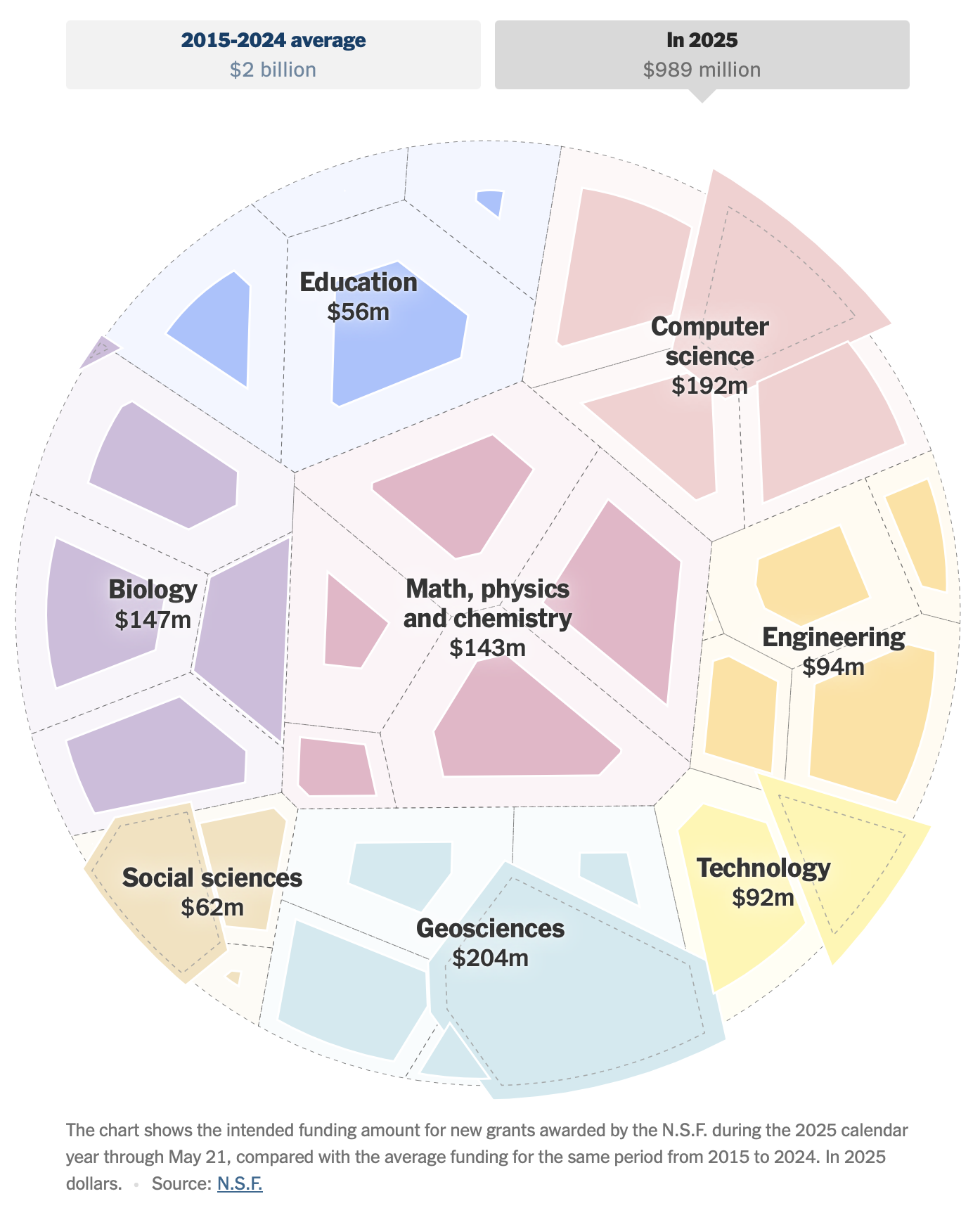
"The National Science Foundation's funding has seen a significant slowdown as illustrated by a circular Voronoi diagram mapping out funding patterns through May 21, displaying various funding categories."
"Instead of the usual robust funding levels, the darker cells indicate a stark decrease across most categories, with only a few showing an uptick in funding compared to the past decade."
"This method of visual representation, reminiscent of previous infrastructure funding displays, creatively presents the stark contrasts in science funding, reminiscent of petri dishes, highlighting areas of concern."
"Historic patterns from 2008, when consumer spending was analyzed, are brought back to highlight how data visualization techniques can effectively communicate shifts in financial support."
The New York Times' Upshot employs a circular Voronoi diagram to illustrate the declining funding from the National Science Foundation up until May 21. The diagram indicates that while four categories have experienced increased funding levels, the majority show significant cuts compared to the past decade. This visual representation draws parallels to previous uses of similar diagrams for infrastructure proposals, highlighting the urgent need for a renewed funding strategy in scientific research, as echoed in earlier analyses of consumer spending dating back to 2008.
#national-science-foundation #funding-trends #voronoi-diagram #scientific-research #data-visualization
Read at FlowingData
Unable to calculate read time
Collection
[
|
...
]