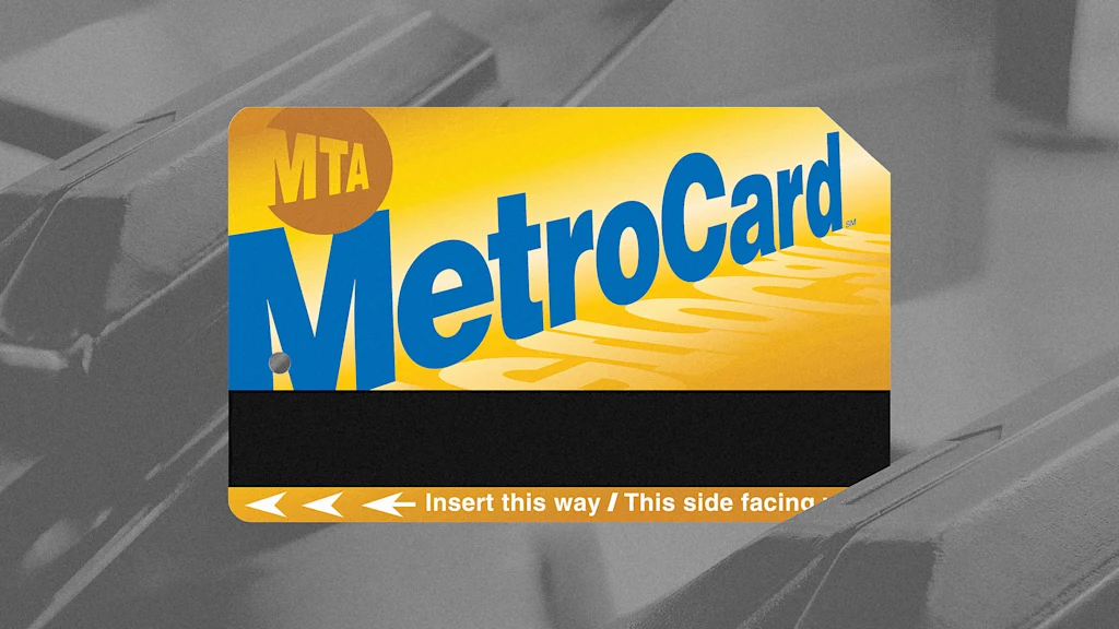
"With its goofy block lettering and bright colors, the MetroCard feels like a relic, which it sort of is-an early 1990s design, complete with gradients and drop shadows, that's managed to stick around long enough to become one of New York's defining symbols. At a time when generic minimalism and the sheen of AI-generated graphics have taken over, its unmistakable graphics feel refreshing."
"For 40 years before the MetroCard, New Yorkers paid for the subway using tokens. Dropping it into a turnstile wasn't much different than paying with coins. The MetroCard was a technical leap that changed how riders experienced the public transit system. "At the time of its introduction, not many people used swipe cards," Shapiro explains. "If you were familiar with them, you probably worked some kind of job where there was a security measure.""
The MetroCard's colorful, early-1990s design with gradients and drop shadows has become a recognizable New York symbol. The 31-year-old fare payment system endured long beyond typical tech lifespans, remaining in circulation despite newer minimalist aesthetics. The MTA will stop selling MetroCards on December 31st and will fully phase them out on an imminent date yet to be announced, prompting public tributes. The New York City Transit Museum opened an exhibition titled 'FAREwell, Metrocard' to document the card's history. The MetroCard shifted the city from token-based fares to swipe-card technology and reshaped commuting habits, payment infrastructure, and municipal design expectations.
Read at Fast Company
Unable to calculate read time
Collection
[
|
...
]