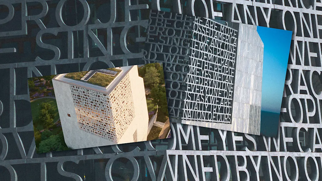
The Barack Obama Presidential Center in Chicago, opening in June 2026, features all-caps lettering wrapping around two sides of its tower. The text, an excerpt from Obama's 2015 Selma speech, is deliberately difficult to read. Designers Michael Bierut and Britt Cobb at Pentagram, working with architects Tod Williams Billie Tsien Architects, intentionally prioritized visual texture over legibility. The lettering functions as an architectural element rather than readable signage, following the tradition of monuments like the Lincoln Memorial where viewers experience text differently—some reading completely, others catching only fragments. The design aims to create visual interest and promise meaning without requiring full comprehension from ground level.
"One of the key questions I asked at the beginning was, are people supposed to read this? Is legibility the primary goal here? Do we want people to be able to stand on the ground, look up at this tower, and read those words? And that was discussed on the client end, and the answer came back, 'No, it should have the promise of meaning, it should be decipherable, everything should be spelled right and it should make sense.'"
"Just as a million people go to the Lincoln Memorial, some of them will stand and read every word of the second inaugural; some people will just admire the statue in the building and kind of take it in, and a couple of words will jump out, but not the whole thing. It's in that tradition that I think we were operating."
Read at Fast Company
Unable to calculate read time
Collection
[
|
...
]