"Jobs criticized the design's details, emphasizing that color contrast, line thickness, and proportions are essential to effective UI design. Balance is key."
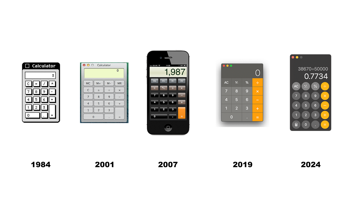
The article explores the design evolution from skeuomorphism to abstraction, highlighting the importance of balancing visual elements in UI design. It recounts the story of a calculator designed by Chris Espinosa for the 1984 Macintosh, where Steve Jobs provided critical feedback on aspects like color contrast, line thickness, and button size. This critique underscores the necessity of attention to detail in creating functional interfaces, showcasing Jobsâ relentless pursuit of aesthetic perfection in product design.
Read at Medium
Unable to calculate read time
Collection
[
|
...
]