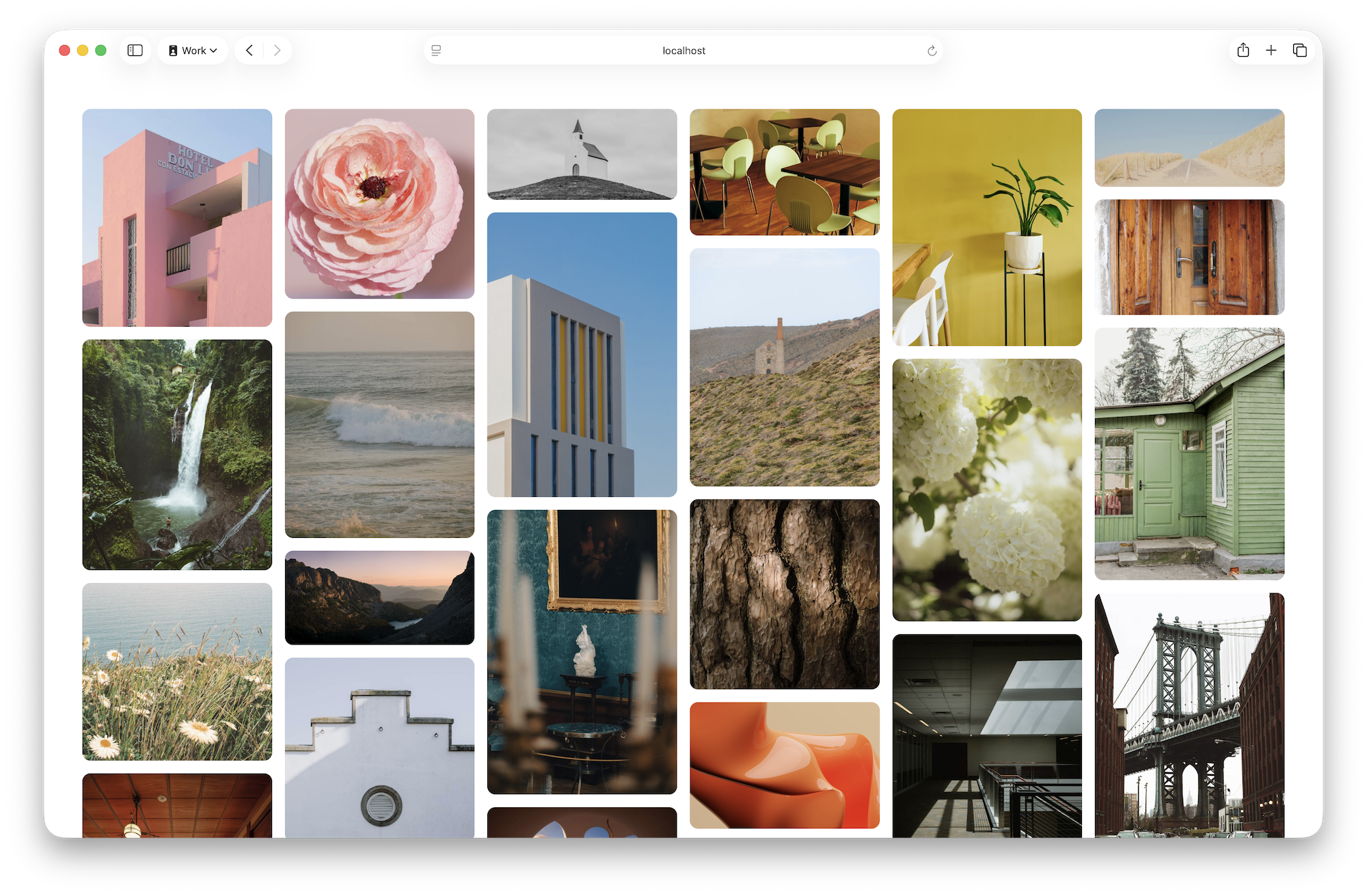
Apply display: grid-lanes to a container to enable masonry-style placement using CSS Grid. Define lanes with grid-template-columns, for example repeat(auto-fill, minmax(250px, 1fr)), to create flexible columns that the browser populates automatically. Use gap: 16px to set consistent spacing between lanes and items. The browser places each item into the column that brings it closest to the top, producing a masonry flow without JavaScript. Users can tab across visible items across lanes for improved accessibility. Grid-template-* rules allow varied lane sizes and creative design variations while supporting infinite loading as the user scrolls.
"Let's start by applying display: grid-lanes to the main element to create a Grid container ready to make this kind of layout. Then we use grid-template-columns to create the "lanes" with the full power of CSS Grid. In this case, we'll use repeat(auto-fill, minmax(250px, 1fr)) to create flexible columns at least 250 pixels wide. The browser will decide how many columns to make, filling all available space."
"Just like the classic Masonry library, as the browser decides where to put each item, the next one is placed in whichever column gets it closest to the top of the window. Like traffic, each car "changes lanes" to end up in the lane that gets them "the furthest ahead". This layout makes it possible for users to tab across the lanes to all currently-visible content."
Read at WebKit
Unable to calculate read time
Collection
[
|
...
]