fromwww.socialmediatoday.com
2 months agoPinterest releases best practices tip sheet for shopping templates
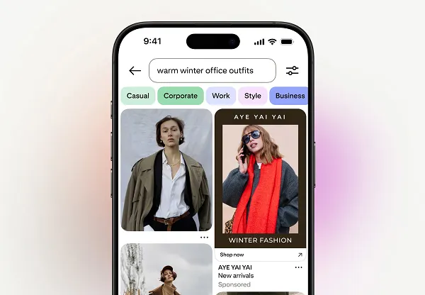
Brands must invest equal creative effort into product Pins as they do upper-funnel storytelling, using templates and context to drive shopping conversions.