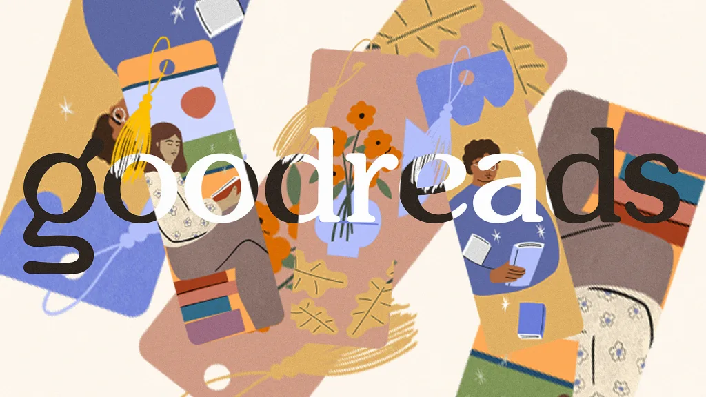
"The logo redesign reflects a shift towards a more modern aesthetic, in tune with the current trends influenced by platforms like Instagram and TikTok."
"Goodreads' previous branding resembled corporate blandness, while the new logo brings a touch of modern whimsy, aligning better with contemporary book design."
Goodreads has undergone its first logo redesign since its inception in 2007, moving away from its previous bland aesthetic to modernize its brand. The former logo, a simple brown wordmark on a cream background, reflected the warm atmosphere of bookstores but became outdated in the face of vibrant trends on social media platforms like Instagram and TikTok. The new logo aims to be more whimsical and visually appealing, highlighting the changing dynamics of book cover design and user engagement that emphasize aesthetics and shareability.
Read at Fast Company
Unable to calculate read time
Collection
[
|
...
]