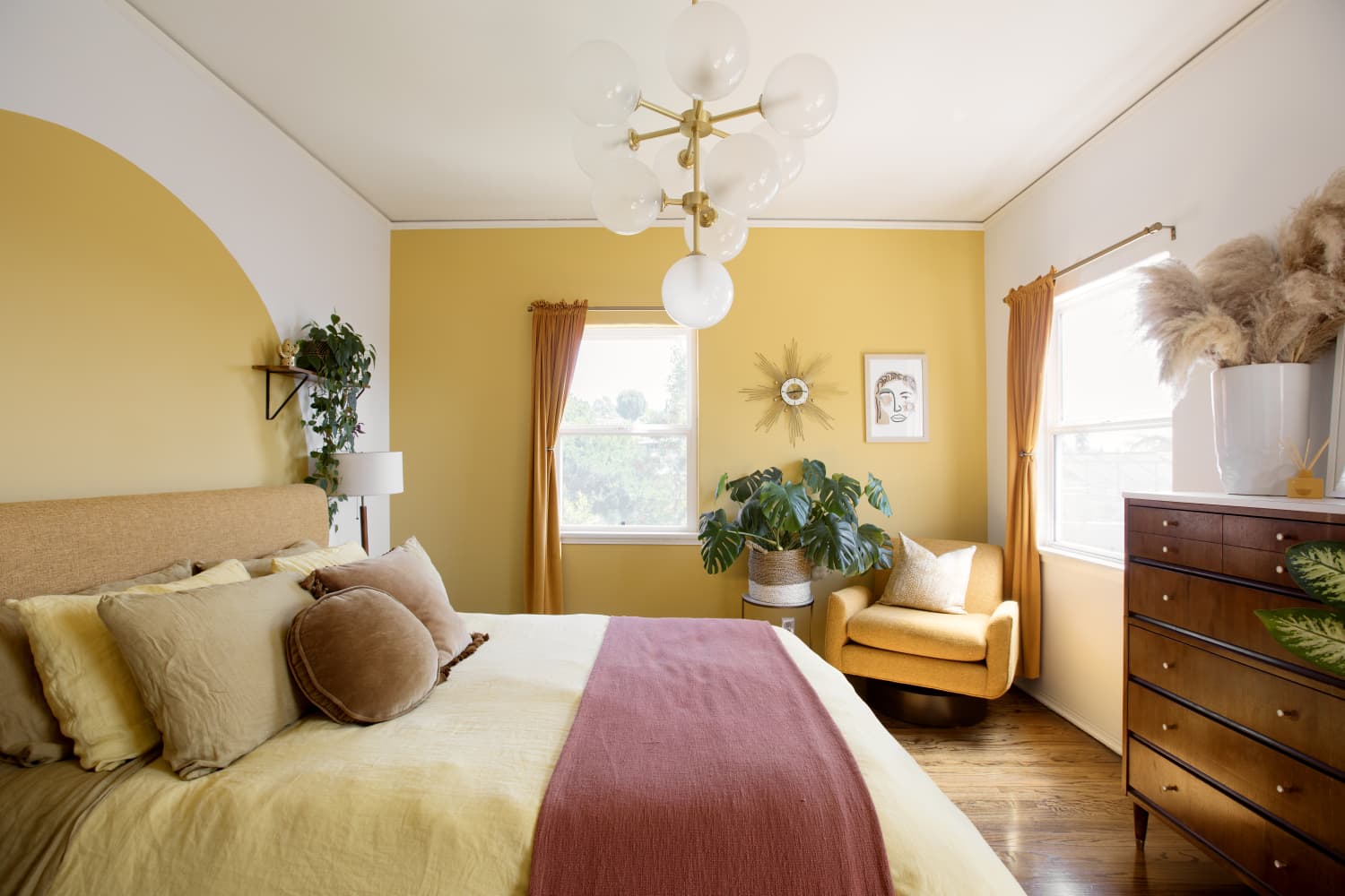
""Whatever shades you go with, focus on one temperature - either cool or warm," says Donna Cameron, a color theory expert with Wise Move. Warm color palettes tend to include the colors in the yellow, orange, and red families, and can feel subtle and comforting like a hug or a nap in the sunshine. Meanwhile, cool color palettes, including blues, greens, and purples, are known for creating a sense of serenity and calm."
"According to Cameron, that sense of calm and balance can be disrupted when warm and cool temperatures come together in one space. "When colors clash or compete for your attention, it's hard to feel settled or know where to fix your eyes, which only makes it difficult for your mind to relax," she says. Cameron goes on to explain that some people love the look of clashing colors and, right now, that is actually quite trendy. However, when it comes to big tasks like repainting or investing in more timeless pieces like rugs, couches, and artwork, mixing and matching cool and warm temperatures is a riskier move."
Decorating typically begins with an overall color palette rather than an individual furniture piece. Choosing a successful palette requires ensuring colors work well together, not simply selecting favorites. Color temperature often matters more than specific hues; maintaining a single temperature group—warm or cool—creates cohesion. Warm palettes (yellows, oranges, reds) evoke comfort, while cool palettes (blues, greens, purples) promote serenity. Mixing warm and cool temperatures can disrupt visual balance and make spaces feel unsettled. Trend-driven clashing can be appealing but poses higher risk for long-term investments such as paint, rugs, couches, and artwork. Keep permanent fittings and finishes simple to avoid visual competition.
Read at Apartment Therapy
Unable to calculate read time
Collection
[
|
...
]