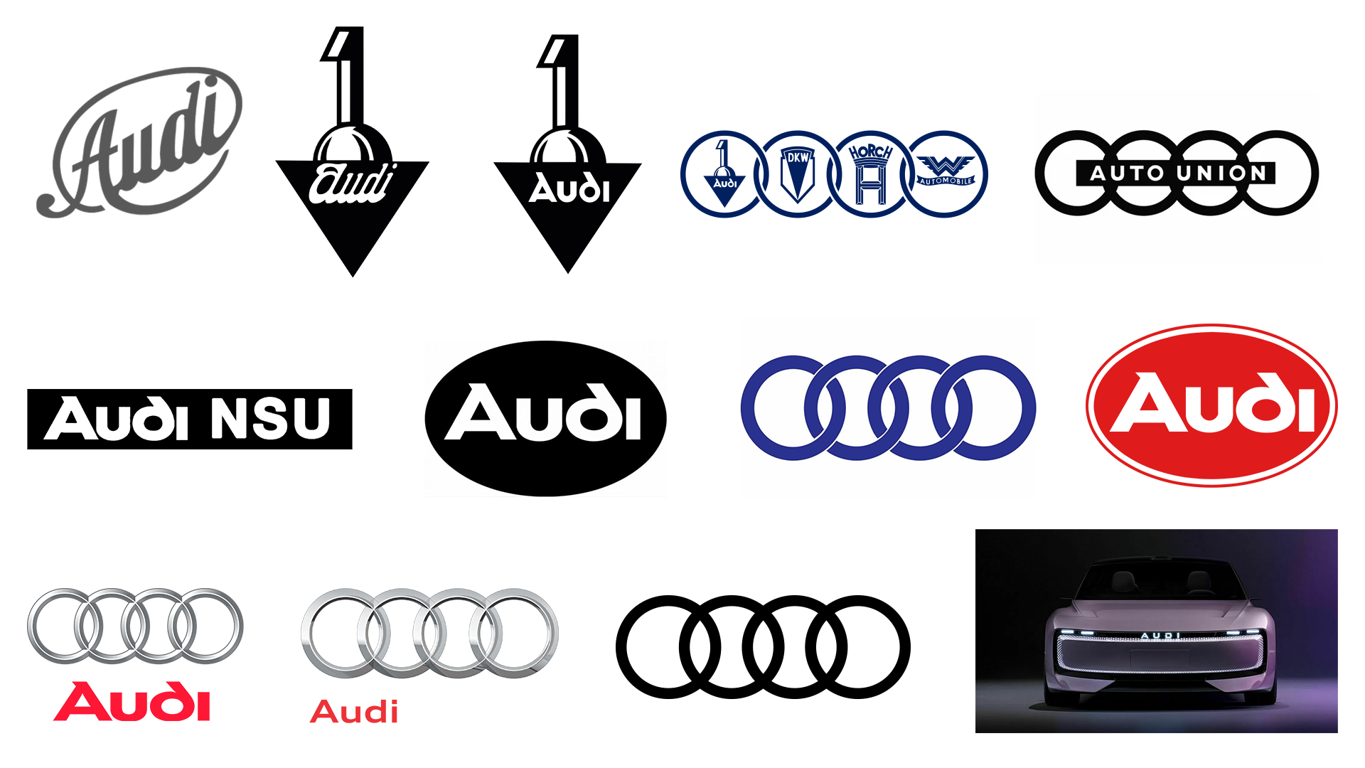
"The Audi logo, a significant emblem in the automotive industry, symbolizes a legacy forged from the union of four companies during the Great Depression, highlighting resilience."
"Through its evolutions and redesigns, particularly the flat design shift and recent controversies, the Audi logo remains a testament to brand identity and recognition."
The Audi logo, featuring four interlocking rings, is a well-known symbol that reflects the brand's heritage and resilience, rooted in a historic merger during the Great Depression. Despite facing rebranding challenges, including a shift to flat design and debates on its visual representation, the logo has maintained its recognition and significance over time. Audi's consistent evolution highlights the importance of design simplicity and brand identity, making its history a valuable lesson for designers and marketers alike. The iconic status of the rings showcases enduring appeal despite the changing automotive landscape.
Read at Creative Bloq
Unable to calculate read time
Collection
[
|
...
]