"The past was bursting with colors, and recently, these shades have gotten lighter, more translucent, faded. For brands, it's part of their design strategy."
"This has become a road brands choose for their branding... It's a consistent move towards reduced colors in line with Apple's 'simplicity' ethos."
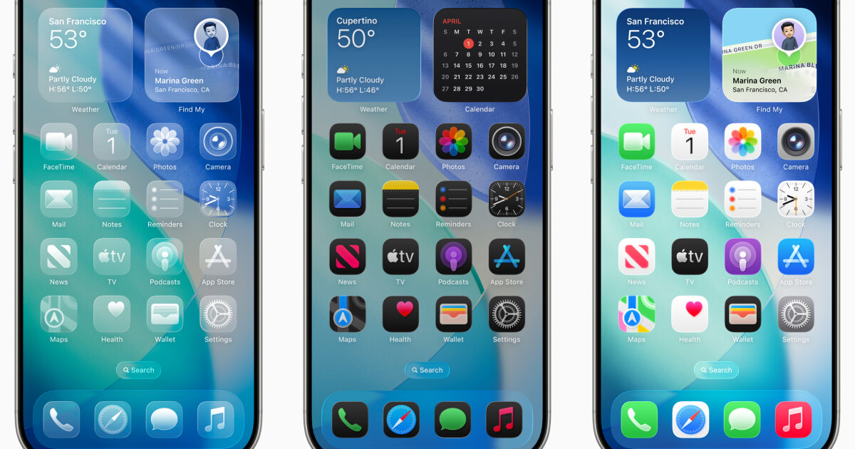
"Users have weighed in on the update... Some have compared it to the floating, glassy icons of Windows Vista."
"The update reminds a user of the Gaussian blur, a technique that makes an image softer or have a smoother appearance."
Apple's recent launch of the Liquid Glass UI has transformed iOS 26 with transparent apps and controls, eliminating vibrant colors for a minimalist aesthetic. This shift echoes a broader industry trend where brands, like Google, have opted for simpler designs featuring muted colors. Users expressed mixed reactions online, some likening the new style to Windows Vista's look. Apple's long-standing commitment to minimalism signifies a move away from its colorful heritage, dating back to its iconic rainbow logo, towards a preference for lighter, translucent aesthetics, aligning with their design ethos.
Read at designboom | architecture & design magazine
Unable to calculate read time
Collection
[
|
...
]