"Sparks' chart highlights a pre-Internet illustration trend, simplifying complex historical content into a digestible format for broad audiences, emphasizing themes of dominance."
"Rebecca Onion describes the chart as reflecting a version of history emphasizing power dynamics among different 'peoples', resonating with historical narratives prevalent between the wars."
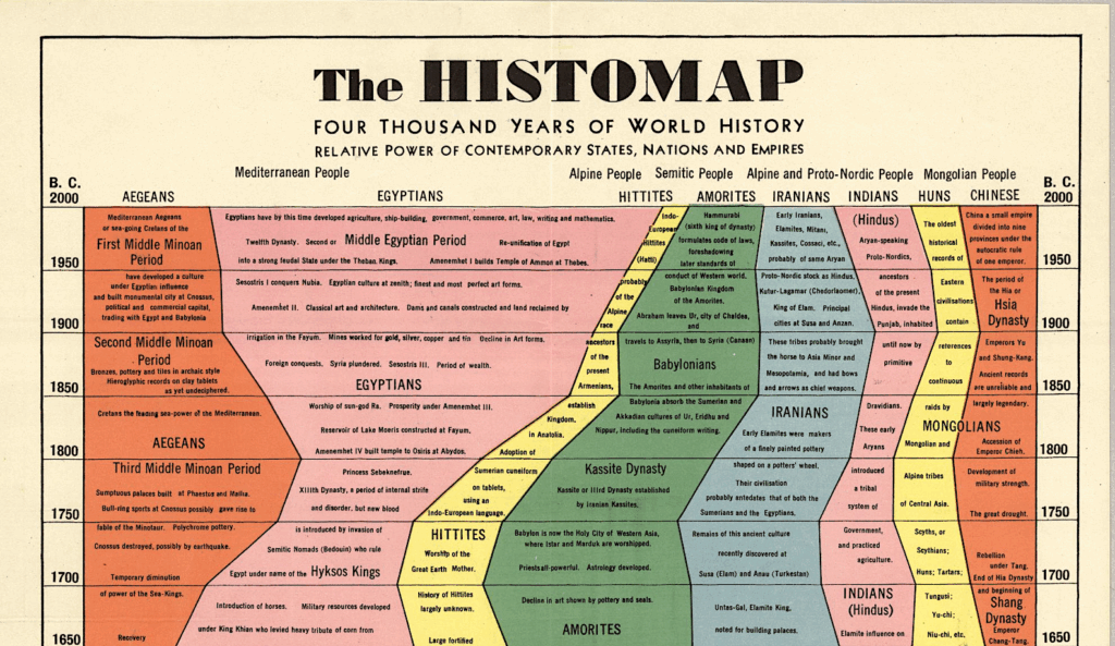
The 'histomap,' created by John B. Sparks in 1931, is an impressive pre-Internet macro-infographic showcasing 4,000 years of global history. It exemplifies the 'outline' illustration trend, condensing vast historical narratives into forms comprehensible to the uneducated public. Rebecca Onion notes that the chart accentuates dominance among various groups, reflecting ideologies prominent in the U.S. between the wars. Despite its oversimplifications, the 'histomap' remains a fascinating artifact illustrating how historical content was depicted and consumed, aligning with contemporary methods of information dissemination in media and the internet.
Read at Open Culture
Unable to calculate read time
Collection
[
|
...
]