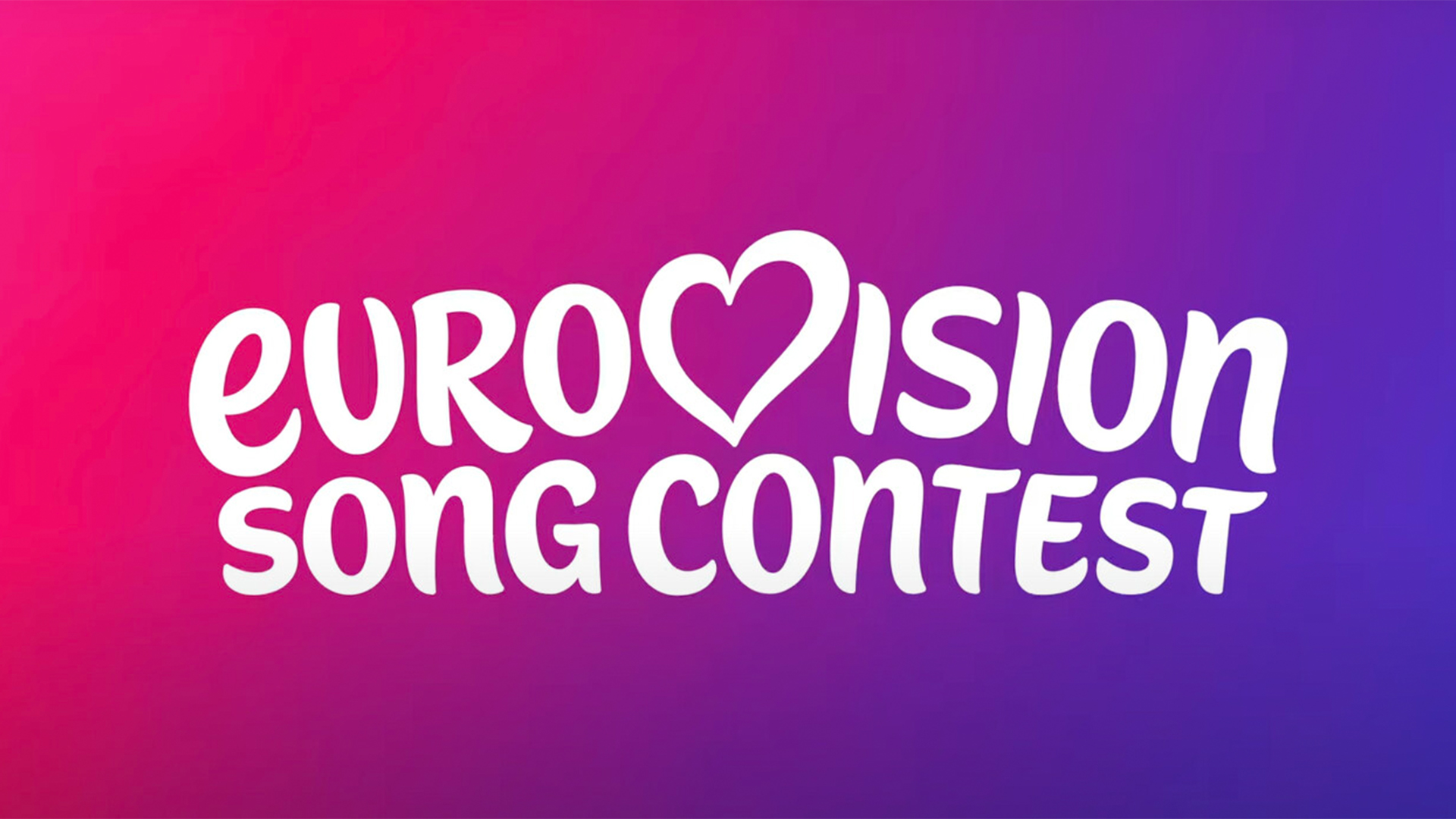
"The new Eurovision logo features distinct tweaks to the well-loved design first debuted back in 2004, taking on a more rounded, juvenile look."
"Fans were extremely vocal about their distaste for the new design, with one calling it 'The biggest downgrade in the entire 70 years of Eurovision history.'"
"Critics noted that the logo's style aligns more with a TikTok rebrand than with a recognizable identity for an international song competition."
"The handwritten quality of the new logo's wordmark diminishes its timelessness, resulting in a lack of the star power seen in previous logos."
The newly unveiled 2026 Eurovision logo has not resonated well with superfans, who feel it lacks the star power and timeless quality of its predecessors. Created by the European Broadcasting Union with UK-based agency PALS, the logo features a more rounded and juvenile handwritten style, making the 'song contest' element more dominant. Many fans expressed disappointment, calling it the largest downgrade in Eurovision's 70-year history. Critics likened the new logo to a TikTok rebrand, arguing it strays too far from the essence of the contest's identity.
Read at Creative Bloq
Unable to calculate read time
Collection
[
|
...
]