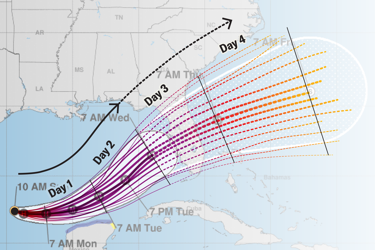
Forecasters present maps that show a storm's current location and predicted path over the next three to five days. The cone of uncertainty represents the typical error range in forecasts for the storm's center, derived from historical forecast errors rather than the specific storm's details. Multiple outlets create versions of the same map, and the National Hurricane Center provides archived and live forecast graphics, such as the 2024 Hurricane Milton example. Each map update plots the center's probable positions at future times, but interpretation requires understanding that areas outside the cone can still experience impacts and that other forecast elements inform hazards.
"If you've ever taken even a cursory glance at a hurricane forecast, you've seen some version of the cone of uncertainty. It sounds like some other-dimensional realm of indecision, but it's a mainstay for communicating hurricane forecasts. Though these maps pack in plenty of valuable information, it can be a bit tricky to interpret them if you don't know exactly what you're looking at. Here Scientific American walks you through all the forecast components and what they meanand, almost as crucially, what they don't."
"We also point you to some other resources that are often the most helpful for those staring down an approaching storm. NHC Forecast On supporting science journalism If you're enjoying this article, consider supporting our award-winning journalism by subscribing. By purchasing a subscription you are helping to ensure the future of impactful stories about the discoveries and ideas shaping our world today."
Read at www.scientificamerican.com
Unable to calculate read time
Collection
[
|
...
]