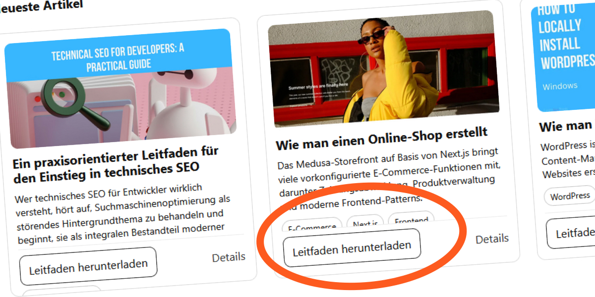
"The layout looked solid at first glance: But once the content changed, the cracks started appearing: Translating the content to French made things worse: German translations pushed the layout even further: What once looked like a stable component turned out to depend on a fragile assumption: that the content would always stay within a fixed height."
"In the design specifications, the pixel dimensions were exact, and you know that cards align more cleanly when they have the same vertical rhythm and equal size, which creates in our mind a sense of order that I and the designer kind of trusted."
"But surprisingly, the behavior changed as soon as the font settings changed. I increased the browser's default text size and realized that it introduced pressure inside the cards. My text blocks grew, but the container remained the same, and elements began competing for the same space."
Fixed-height card designs appear stable but can break when content changes, such as translations or user font size adjustments. Initially, a blog's 'Recent Articles' section seemed well-structured with short titles and excerpts. However, longer translations and increased font sizes revealed the fragility of the layout. The design relied on fixed dimensions, which created a false sense of order. When font settings changed, the text blocks expanded, leading to competition for space within the cards, ultimately compromising the layout's integrity.
Read at CSS-Tricks
Unable to calculate read time
Collection
[
|
...
]