#responsive-design

[ follow ]
#css

A Friendly Introduction to Container Queries * Josh W. Comeau

Container queries enable conditional CSS based on container size, addressing a significant gap in responsive design.

This One Simple Change Makes Your Website More Accessible

Typography is essential for digital accessibility, ensuring readability across various browser font sizes.

font-size Limbo

Modern web design requires larger base font sizes due to evolving screen technologies and user accessibility needs.

"Smart" Layouts With Container Queries | CSS-Tricks

Container queries enhance flexibility in design beyond viewport metrics, offering smarter solutions compared to traditional media queries.

Tables with Fixed Headers and Horizontal Scroll

Creating an HTML table with fixed headers and horizontal scroll is complex, requiring careful design to retain visibility and functionality as content scales.

CSS { In Real Life } | Logical Properties in Size Queries

Media queries lack support for logical properties, limiting their use despite new range syntax that allows comparison operators.
morecss
#web-development

New CSS that can actually be used in 2024

CSS innovations in recent years significantly alter web design practices, particularly with logical properties and container queries.

How to Gain Web Development Skills

Brooklyn seeks to enhance residents' web development skills amid tech job demand.
Responsive design and front-end coding are vital skills for aspiring web developers.

A guide to the best email editing tools - LogRocket Blog

Email editors enable non-coders to create professional-looking, responsive emails using drag-and-drop interfaces and templates.

Yumma CSS - The New Alternative to Modern CSS Frameworks | HackerNoon

Yumma CSS offers a simpler syntax for building responsive web components compared to Bootstrap and Tailwind CSS.

Responsive Tables & Readable Paragraphs

Responsive design improvements on Wikipedia enhance mobile reading, though issues with text cut-off remain due to 'magic numbers'.
Sticky positioning of elements aids user navigation and overall experience.

CSS making my page responsive for smaller screens

Responsive design can be achieved using media queries without redoing the entire layout.
Investigate grid overlap issues by examining element heights and positioning.
moreweb-development
#javascript

Table Navigation Section Discussion (Re-Opened)

The legal templates page has made notable progress in design, yet challenges with navigation and functionality remain.
Neither the buttons nor tables are functioning correctly, prompting adjustments in HTML/CSS before further JavaScript refinements.

Incremental growth in horizontal scrolljack. I'm stuck!

Use JavaScript or CSS to trigger width changes based on scroll position.
Implement Intersection Observers or scroll events for viewport detection.
Combine CSS transitions for smooth resizing effects.
morejavascript

Embedding/importing another webpage into a new page - bad encoding?

Use JS or PHP to modify how notes pages are loaded and displayed with additional content.
#jquery

Customizable & Filterable Gallery In jQuery - tabX

tabX is a versatile jQuery plugin that simplifies the creation of responsive and customizable web galleries.

Responsive jQuery Content Slider with Animations - Bxslider

bxslider is a fully responsive jQuery Slider Plugin with various features and easy installation.

Tiny Responsive Lightbox Gallery Plugin For jQuery - Viewbox

Simple jQuery plugin for a responsive image gallery with lightbox view.

Responsive Lightbox Slider For The Web - jQuery imagesSlider

imagesSlider is a lightweight jQuery plugin for responsive lightbox sliders.
It uses CSS flexbox for responsiveness and jQuery fade functions for smooth transitions.
morejquery
#web-design

GitHub - garronej/screen-scaler: One-size-fit-all web design: Screen-size agnostic development environment.

Design for specific screen size can enhance user experience
Screen-Scaler automatically adjusts app to fit any screen size

Understanding and supporting zoom behaviors on the web - LogRocket Blog

Web developers must prioritize accessibility as device diversity increases, ensuring user-friendly experiences across various screen types.

Using the 5 types of grids to build intuitive UIs - LogRocket Blog

Grids are essential in UI/UX design for creating functional and visually appealing layouts that enhance user experience.

Figma Tutorial: Designing the Hottest Hero Trends of 2024

Starting with a simple hero web design layout, morph into 5 different layouts.
Designing popular hero layout trends of 2024 for web and mobile, focusing on responsive and adaptive design.

How To Use Responsive Web Design for Your Ecommerce Store (2024) - Shopify

Responsive web design ensures a uniform and optimal user experience across various devices, crucial for modern ecommerce.

003-about page-flexbox vs grid options to further optimize for mobile

Use <article> for the biography section to enhance the semantic structure.
CSS Grid is preferable for complex layouts with multiple items in mobile view.
moreweb-design
#ui-design

Why the 4-point grid system dominates UI design

Consistently using proportional scaling, particularly a 4-point grid, is essential in modern UI design for visual clarity and compatibility across devices.

Why the 4-point grid system dominates UI design

A 4-point grid enhances visual hierarchy and design consistency across devices.

Why UI designers should understand Flexbox and CSS Grid

Move beyond responsive column-based design with modern CSS layouts
Understanding each other's tools and limitations is crucial for collaboration in design and development

Responsive layout grid in Figma

Responsive layout grids in Figma ensure design adaptability across screens.
Creating columns grid in Figma aids in aligning UI elements horizontally.

Why the 4-point grid system dominates UI design

Consistently using proportional scaling, particularly a 4-point grid, is essential in modern UI design for visual clarity and compatibility across devices.

Why the 4-point grid system dominates UI design

A 4-point grid enhances visual hierarchy and design consistency across devices.

Why UI designers should understand Flexbox and CSS Grid

Move beyond responsive column-based design with modern CSS layouts
Understanding each other's tools and limitations is crucial for collaboration in design and development

Responsive layout grid in Figma

Responsive layout grids in Figma ensure design adaptability across screens.
Creating columns grid in Figma aids in aligning UI elements horizontally.
moreui-design

Death, taxes and milli-Ems

Design requires responsiveness across diverse devices, demanding new skills from designers.
Balancing design fidelity with adaptability is crucial in modern design practice.
#user-experience

How to make tables fit on small screens (spoiler: you probably can't and maybe you shouldn't)

Rethink responsive design by focusing on user needs and adaptive components for a better user experience.

Email Marketing Design Best Practices: 17 Key Things to Know

Creating a modular design system enhances email functionality and saves time in the long run.

Adobe Captivate 12.3 - Resizing slide sizes for publishing - eLearning

Responsive projects in Adobe Captivate may cause layout changes upon publishing; maintaining specific slide sizes may require better configuration options.

Creating adaptive and responsive UIs in React Native - LogRocket Blog

Adaptive UIs are essential for a consistent user experience across diverse devices.
Responsive layouts and adaptive components are key to fluid and flexible app designs.

Responsive Design in Adobe Captivate: Scaling Padding with Auto Layout | eLearning

Adobe Captivate's Auto Layout enhances responsive design by proportionally adjusting padding across devices, ensuring visual consistency.

Council Post: Why Plumbing Contractors Need Responsive Website Design

Responsive websites are essential for improving visibility and user experience, especially for home service businesses.
moreuser-experience
#css-layout

Left Half And Right Half Layout - Many Different Ways | CSS-Tricks

CSS allows for multiple methods to create equal-height columns, balancing design with content flow.

Pixel Perfect Figma to Tailwind

Improve design fidelity with Tailwind CSS workshop by implementing a redesign of Epic Stack Homepage from scratch.
morecss-layout

Council Post: Mobile Marketing Trends You Can't Afford To Ignore

Mobile devices are essential for marketing strategies as they dominate web traffic.
Adopting mobile-first indexing is crucial for SEO success.
Creating mobile apps enhances engagement and retention in marketing campaigns.

Ars 9.0.1 redesign is now live, with density tweaks and visited link colors

The recent redesign of Ars Technica was largely influenced by reader feedback aiming to improve readability, layout options, and overall user experience.

Building a scalable design across mobile and desktop - LogRocket Blog

Technology adoption demands scalable design for digital products to maintain usability and accessibility across diverse devices.
#figma

Optimizing Figma variables and components

Building a flexible design system in Figma using tokens and components.

How to lock aspect ratios for responsive media in Figma

Properly locking aspect ratios in Figma prevents image distortion and cropping during responsive design.

Optimizing Figma variables and components

Building a flexible design system in Figma using tokens and components.

How to lock aspect ratios for responsive media in Figma

Properly locking aspect ratios in Figma prevents image distortion and cropping during responsive design.
morefigma

Newbe on Captivate Classic - eLearning

Using custom skins effectively can improve project visuals.
Testing on various devices is essential to ensure Fluid Boxes display correctly.

Object-Oriented UX (OOUX) with Sophia Prater

Object-Oriented UX focuses on creating intuitive user experiences through identifying key entities, minimizing moving parts, and enhancing communication among designers and stakeholders.

Going beyond pixels and (r)ems in CSS - Absolute length units - iO tech_hub

Absolute CSS units like pixels can be useful for precise layouts and working with external media.
Absolute units like centimeters, millimeters, and inches are suitable for print layouts and fixed-size outputs.

An Interactive Guide to CSS Container Queries

CSS container queries focus on adjusting components based on container width, not just viewport width.
Using container queries allows for more precise control over component behavior compared to traditional media queries.

Optimizing Multi-Device Learning Experience with the All-New Adobe Captivate - eLearning

Modern learners prefer on-the-go learning.
Multi-device learning adapts content for various devices, ensuring a seamless learning experience.

Button Style 245

Users prefer mobile devices for browsing and shopping due to convenience.
Web development should prioritize user experience and responsive design.
#vuejs

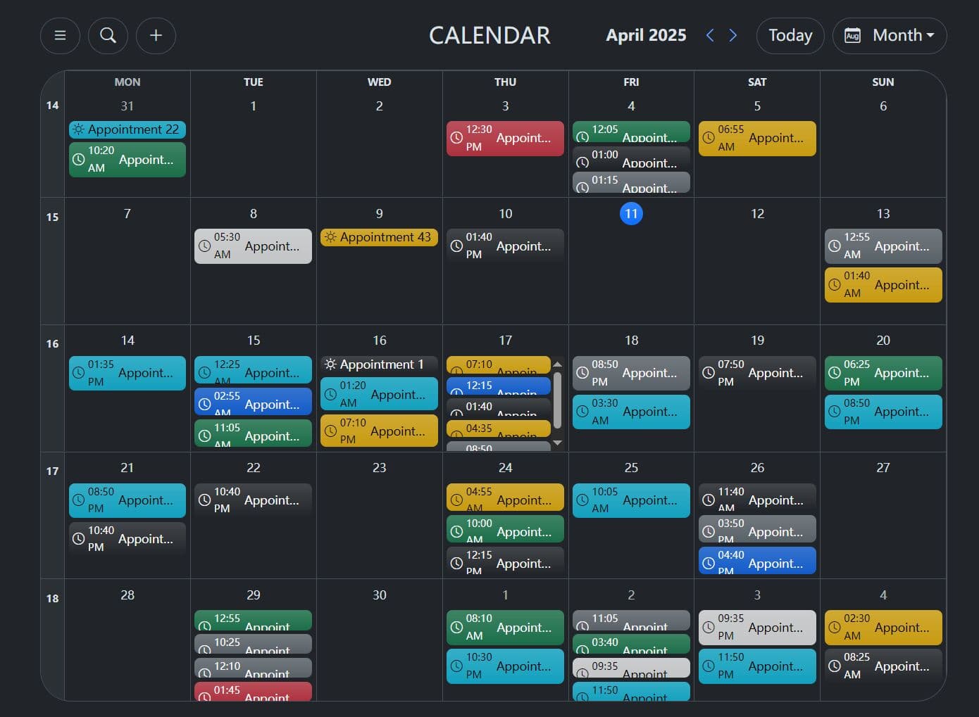
Vue.js component for building interactive and customizable schedules

Easily visualize events on a timeline with adjustable scales
Customizable styling for consistent design and aesthetic appeal
Seamless functionality across different screen sizes

A real-time chat application built with Vue.js and Firebase

Real-Time Chat
User Authentication

Age Calculator App in Vue.js

Users can view their age in years, months, and days after submitting a valid date through the form.
Users will receive validation errors if any field is empty, the day or month number is invalid, or the year is in the future.
morevuejs

Web Design Strategies for Building Sustainable Websites: Nurturing the Digital Ecosystem - Social Media Explorer

Optimize performance for speed and efficiency
Implement responsive design for accessibility
Choose energy-efficient hosting solutions

A Vue 3 Marquee Component Designed to Create Smooth Marquee Animations

Vue3 Marquee is a Vue 3 component for creating customizable marquee animations.
It is compatible with Vue 3 projects and supports both horizontal and vertical marquee animations.

Enhancing Language Learning with Adobe Captivate - eLearning

Adobe Captivate enhances language learning with responsive design, branching scenarios, and gamification features.

Fluid Hover Cards with Tailwind CSS Tutorial

Tailwind CSS, Flexbox, and CSS Grid enable responsive designs and engaging interactions.
[ Load more ]