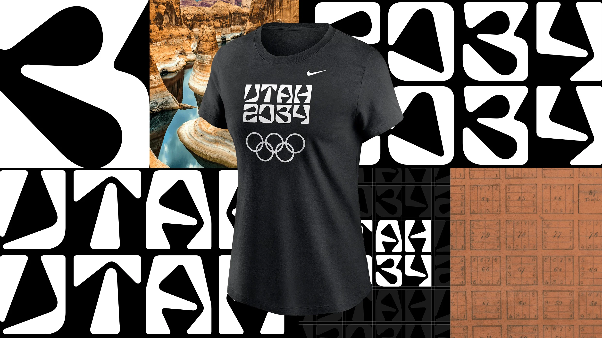
"The Salt Lake City Olympics planned for 2034 are now the Utah Games after organizers announced a new logo and name to reflect the multi-community work that goes into hosting the largest winter sports event on Earth. The state's Governor, Spencer Cox, says the new logo has united people-though not in a good way. "It's really brought people together because everyone seems to not like it," Cox said at a recent press conference."
"It spells out "Utah" in irregularly shaped characters (does that say "IJTAH?") that are stacked on top of "2034." Its launch color palette is just black and white. Cox called the logo bold. "I'm a little old-fashioned and it's certainly a bold logo," he said. The comment section of one local Utah news site included reviews like "beyond terrible," "a marketing disaster," and "unreadable.""
"This bare-bones logo, though, is just the beginning of what will become an expansive visual brand expressed across venues, apparel, and more. It's a starting point, not a finish line. "I think that Olympics are uniquely a moment to do something new and different. And yet, many Olympics have bland and forgettable design," Doug Thomas, an associate professor at Brigham Young University's Department of Design and author of Never Use Futura, tells Fast Company."
Organizers renamed the Salt Lake City 2034 Winter Olympics the Utah Games and unveiled a temporary black-and-white, typography-only logo. The emblem spells "Utah" in irregular stacked characters above "2034" and will serve as a transition identity until a final emblem is released in 2029. The minimalist mark provoked negative reactions online and from some local officials, with criticisms calling it unreadable and hurtful for omitting Salt Lake City. Organizers describe the mark as a starting point for a larger visual system across venues and merchandise. A design professor praised the team's bold attempt to create something memorable.
Read at Fast Company
Unable to calculate read time
Collection
[
|
...
]