"The colors are very personal, they really love brights, particularly blues and greens. One of the clients had picked up a card of 12 colors by Farrow & Ball."
"It was poorly laid out, with unattractive bathrooms, one too big and one too small. The kitchen was centrally located but its two walls of workspace were so far apart."
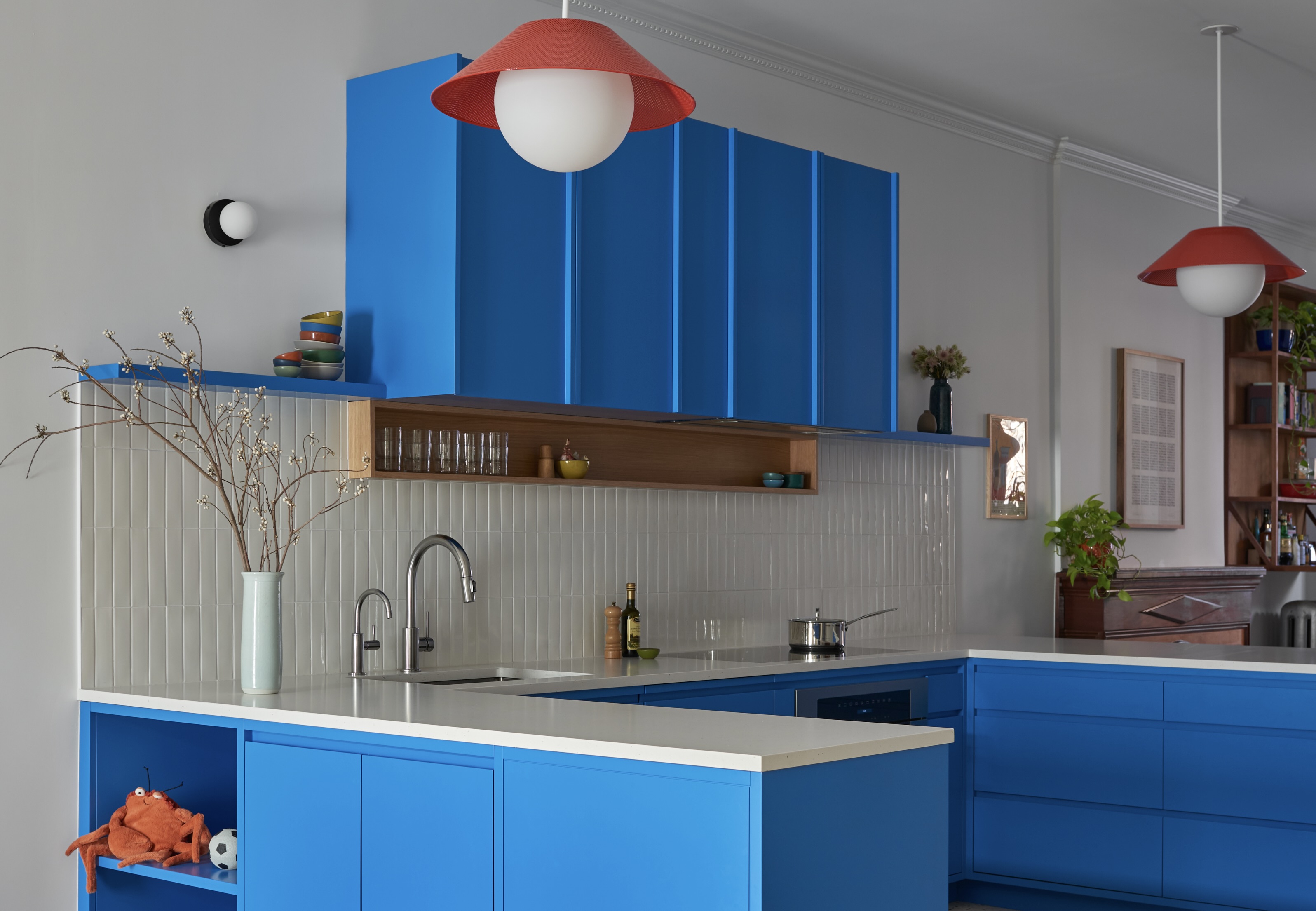
"Normally I do a large island, but after many iterations, I came up with this C-shape with peninsulas. Then we really packed in a lot of storage on the opposite wall."
"The entry vestibule announces, with Josef Frank wallpaper and floor tile in eye-popping red, that this home is not shy about color."
Luki Anderson, architect from Studio Officina, renovated a vintage row house for a young family, emphasizing bright colors and optimized space. The home features a newly created layout with a central kitchen and defined zones. Anderson addressed prior layout issues, opting for a C-shaped kitchen design for better flow and ample storage. The personal color palette includes bold hues inspired by a curated card from Farrow & Ball, highlighted by eye-catching wallpaper and tiles that announce the home's vibrant character.
Read at Brownstoner
Unable to calculate read time
Collection
[
|
...
]