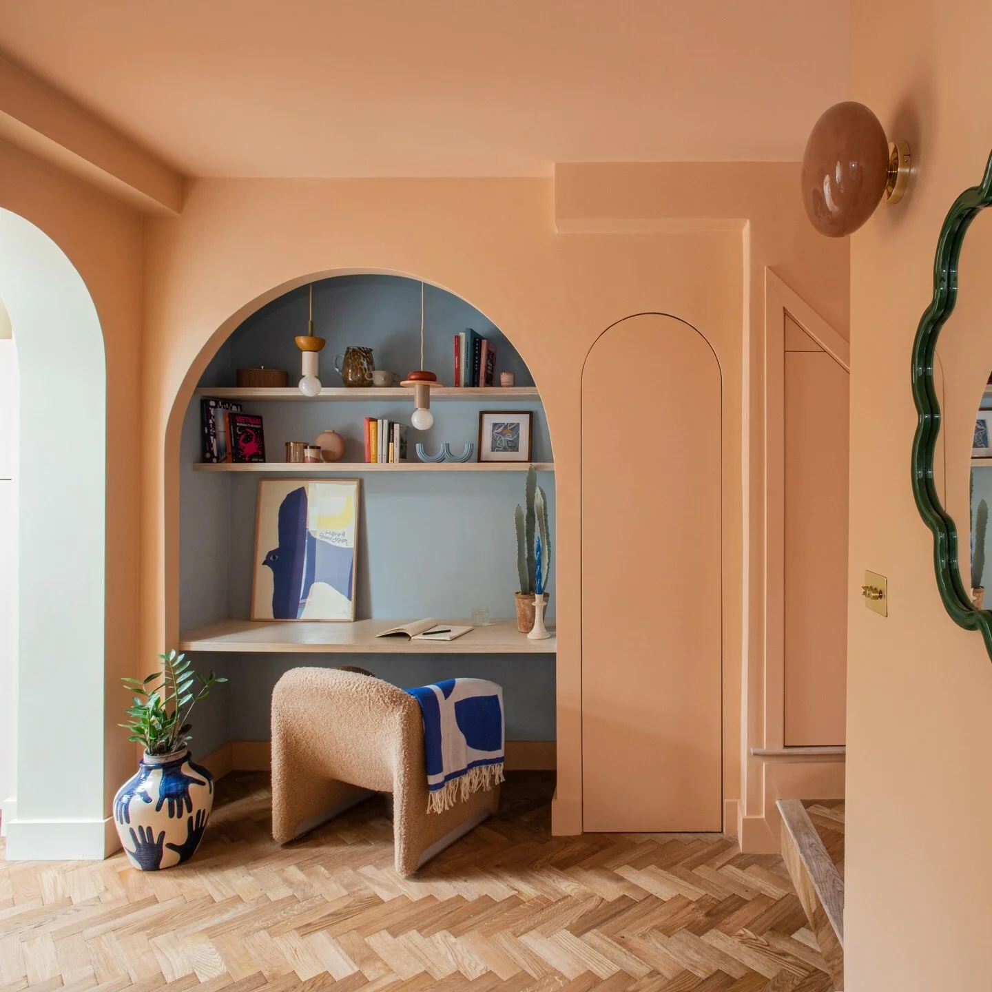
#paint-colors
#paint-colors
[ follow ]
#interior-design #home-decor #color-psychology #color-trends #diy #home-improvement #home-office #home-renovation


fromwww.housingwire.com
4 months agoBetter Homes and Gardens Real Estate details homebuyer trends
Homeownership remains one of life's most monumental transactions, and today buyers are approaching that life goal with new expectations, said Ginger Wilcox, president of Better Homes and Gardens Real Estate. High barriers to entry have created a generation of buyers who know what they want and won't settle for less. These insights can help sellers and agents make design and presentation choices that resonate with modern buyers who are eager but increasingly discerning.
Real estate
fromApartment Therapy
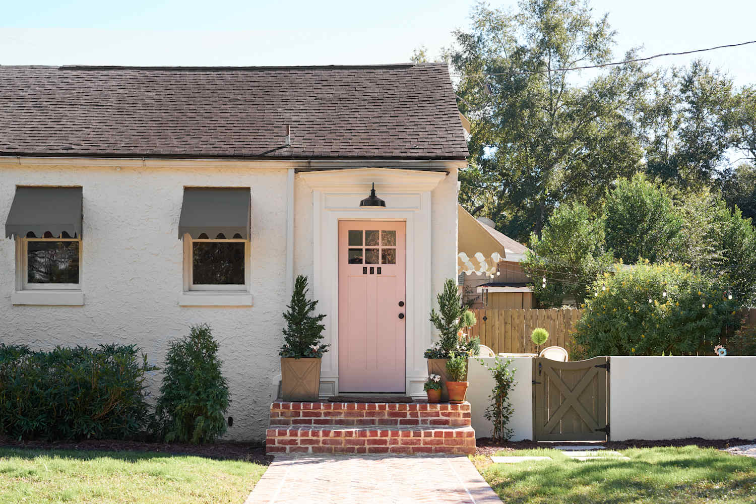
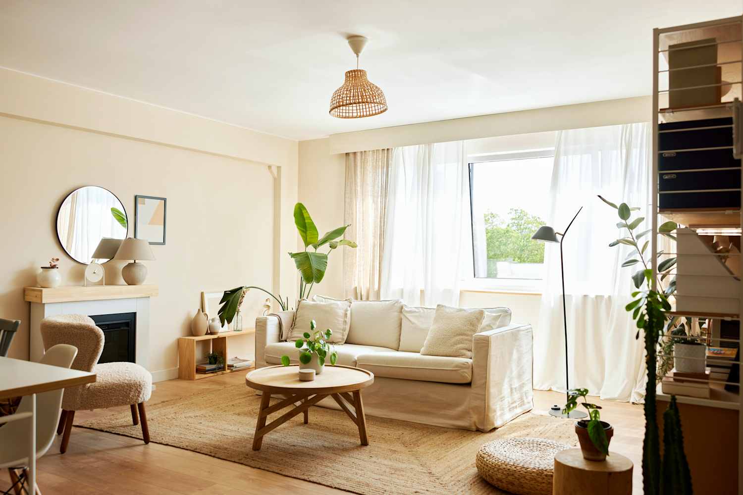
4 months agoI Painted Every Room in My House The Same Shade, and I Love It
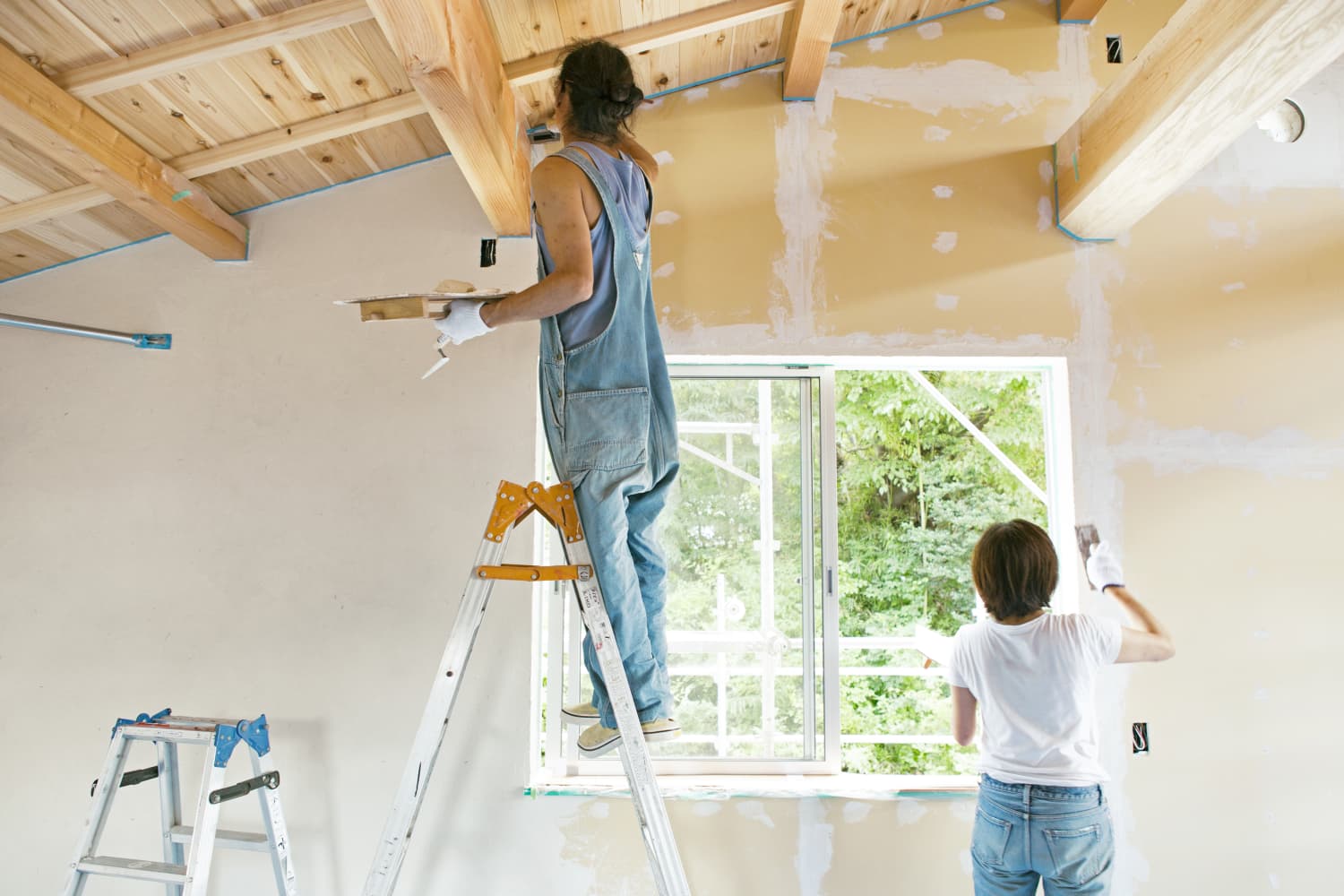
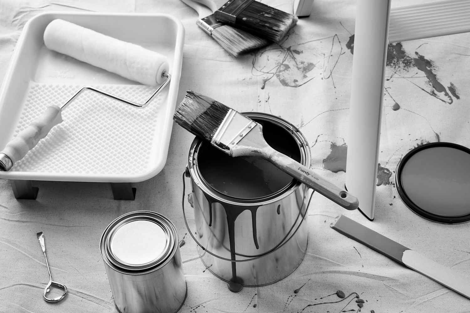
My husband and I recently remodeled our first home. While it was an amazing experience, we quickly learned that the most difficult part of renovating is the countless number of decisions you have to make all at the same time. I've always felt confident in my decorating selections, but this time, I was completely and utterly overwhelmed. For example, choosing paint colors might sound fun, but it was easily one of the most stressful steps.
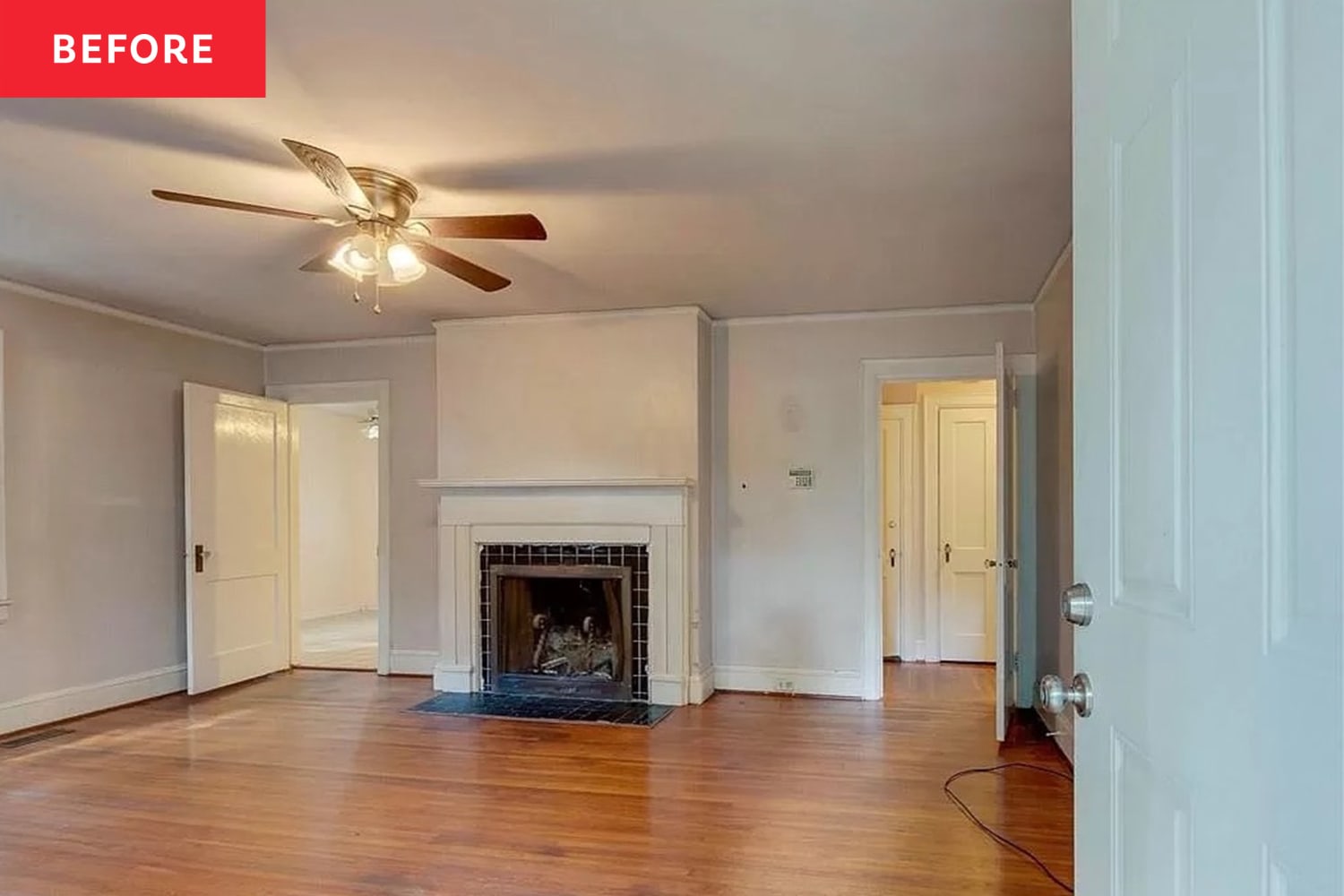
Remodel

Remodel
fromApartment Therapy
8 months agoBefore & After: A Plain Bedroom Got a "Serene, Ethereal, & Romantic" Makeover
Bedroom transformed with dramatic green wallpaper mural, light-blue faux limewash paint, LED backlighting behind a pinkish-purple velvet headboard, deep-aqua trim, and automatic blinds.
[ Load more ]