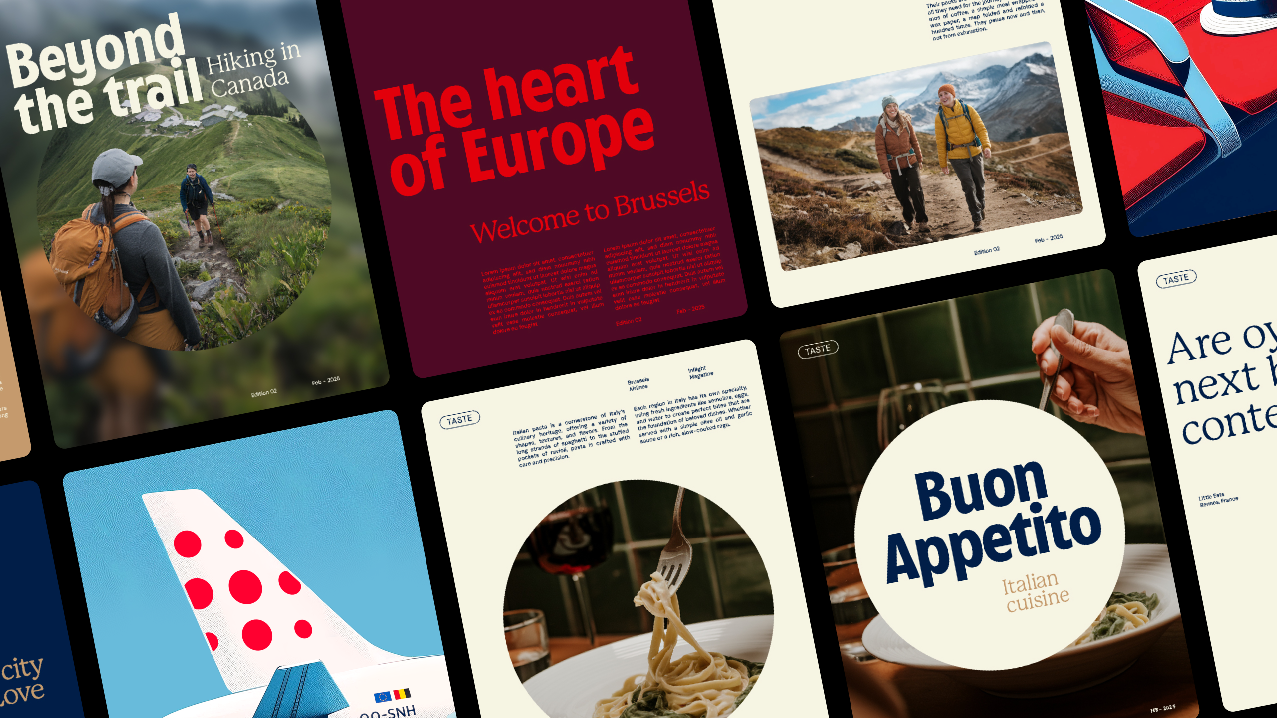
"Brussels Airlines aimed to enhance their brand identity without altering the existing logo by focusing on warmth and distinctiveness, embodying the phrase 'Small details. A world of difference.'"
Brussels Airlines sought to rebrand itself to feel more warm and welcoming, contrasting previous iterations that felt corporate. The design agency WeWantMore focused on small, significant details rather than altering the existing logo or color palette, encapsulating the new brand essence 'You're in good company' and the concept 'Small details. A world of difference.' They introduced a refined color palette, a focus on a single logo dot, and a custom typeface. The rebranding aims to provide a boutique hotel-like experience in the sky, enhancing the airline's distinctiveness.
Read at Creative Bloq
Unable to calculate read time
Collection
[
|
...
]