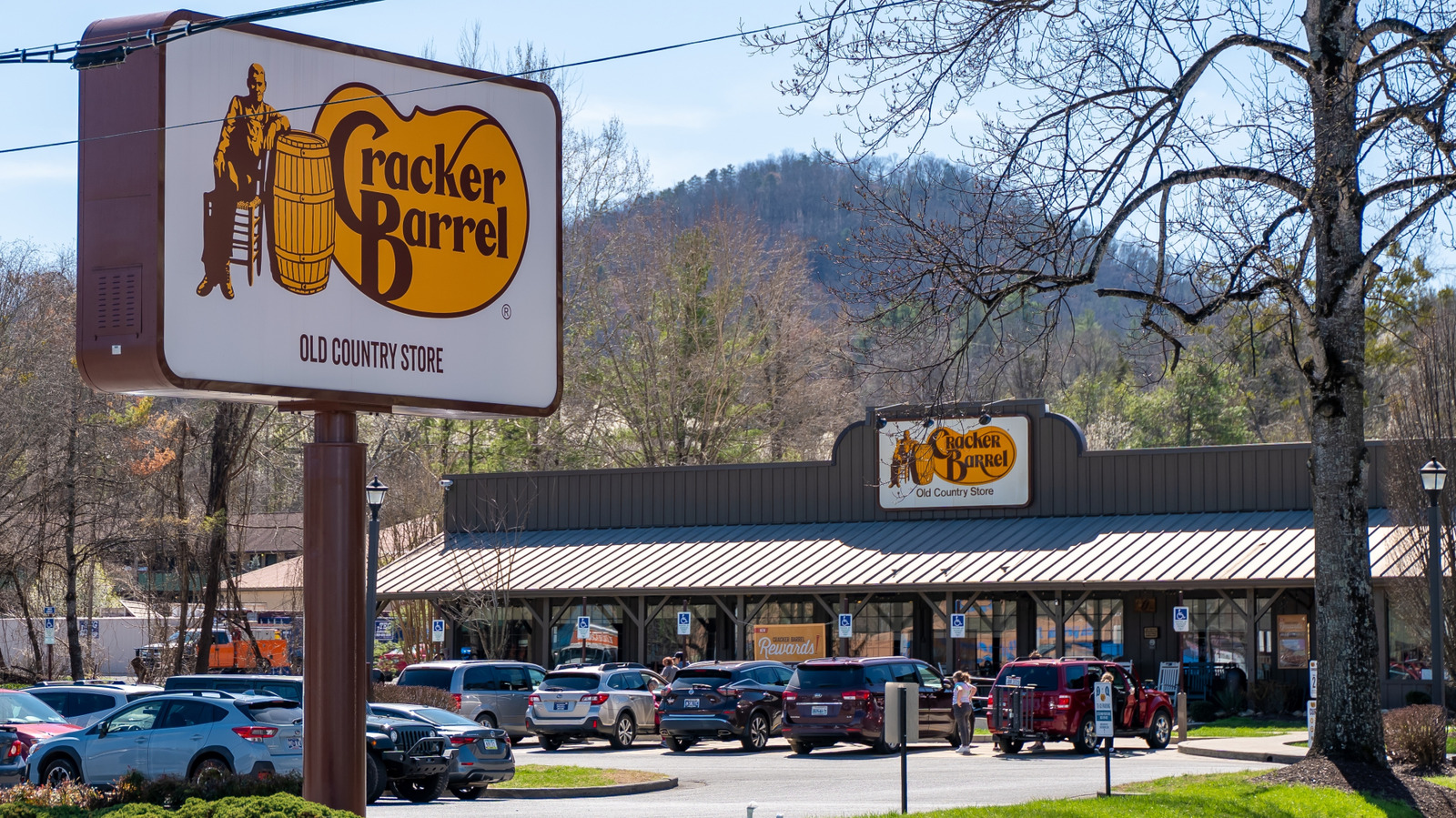
"The Cracker Barrel brand has always leaned heavily on nostalgia, with the restaurant chain's locations embodying the feel of an old country store. The menu is filled with comfort food classics, and the restaurants themselves are packed with antique knick-knacks that evoke a different age. But recently, the brand has changed its tactic slightly, attempting to bridge the gap between its origins and modern design aesthetics."
"This newest change comes as part of a campaign that the brand is calling "All the More," which seeks to keep the best aspects of the brand - there will be no shortage of country hospitality or the self-described "abundant portions of craveable homestyle food" - while also turning a new leaf geared toward the future. In addition to the restaurant remodels and revamped logo, the brand is also changing the packaging of its products sold in the chain's in-restaurant stores."
Cracker Barrel adopted a modernized brand strategy combining nostalgic core elements with contemporary design. The chain began 2024 store remodels and replaced the longstanding icon of an old man leaning on a barrel with a minimalist wordmark set in a new typeface on its familiar gold background. The "All the More" campaign emphasizes preserved country hospitality and abundant homestyle portions while updating packaging and an overall color palette inspired by menu items like scrambled eggs and country biscuits. The brand will celebrate the refresh with a New York City launch event on August 21 featuring country artist Jordan Davis and live music.
Read at Tasting Table
Unable to calculate read time
Collection
[
|
...
]