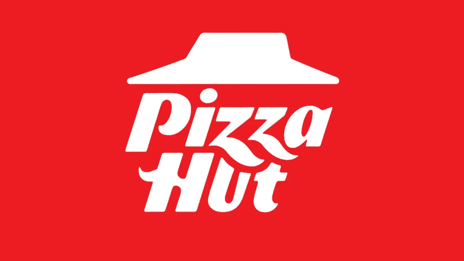
"Restaurant chain Pizza Hut has announced a new logo design for its branches in the UK, Canada and some other markets. The new look moves away from the round background (below) - presumably meant to evoke a pizza - and has echoes of an older design originally introduced in the 1970s, which is still used in the US today. The refreshed brand retains the iconic 'hut' element of the design, and, like some previous versions, uses an italicised fonts."
"The new logo stands out amongst a sea of similar-looking logos thanks to the use of italics and the fun lettering. It also feels contemporary, and will work well online and at small sizes. By making the logo reminiscent of the 90s logo, Pizza Hut is tapping into nostalgia, and let's not forget that for many this will be a nostalgic brand anyway."
Pizza Hut introduced a refreshed logo for branches in the UK, Canada and select markets, removing the round pizza-evoking background and echoing an older 1970s design still used in the US. The redesign retains the iconic 'hut' element, employs italicised fonts and adds jaunty flourishes on the 'z' and 'h', creating a playful, contemporary wordmark that scales well online and at small sizes. The rollout applies to some territories rather than unifying all markets, taps 1990s nostalgia, and maintains strong brand recognition despite minor legibility concerns where the 'z' overlaps the 'u'.
Read at Creative Bloq
Unable to calculate read time
Collection
[
|
...
]