"In the world of custom eLearning, good content alone isn't enough. Learners expect intuitive, engaging, and accessible platforms that supportânot hinderâtheir learning experience."
"Utilizing too many fonts, not enough whitespace, too many colors, or too few colors can impact the balance on screen, leading to a struggle to fight boredom."
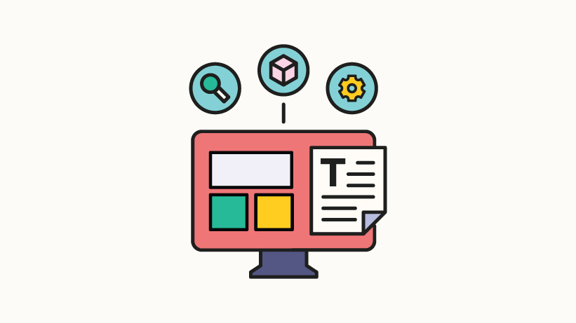
The article emphasizes that in custom eLearning, good content is insufficient without a strong User Experience (UX) and User Interface (UI). Learners demand engaging, intuitive platforms that align with their learning needs. It outlines common design pitfalls, such as poor text-to-graphic ratios and inconsistent design languages, which can demotivate users. By adhering to best practicesâlike maintaining a balanced visual design and creating a style guideâeLearning professionals can enhance the overall educational experience, making it more accessible and enjoyable for learners.
Read at eLearning Industry
Unable to calculate read time
Collection
[
|
...
]