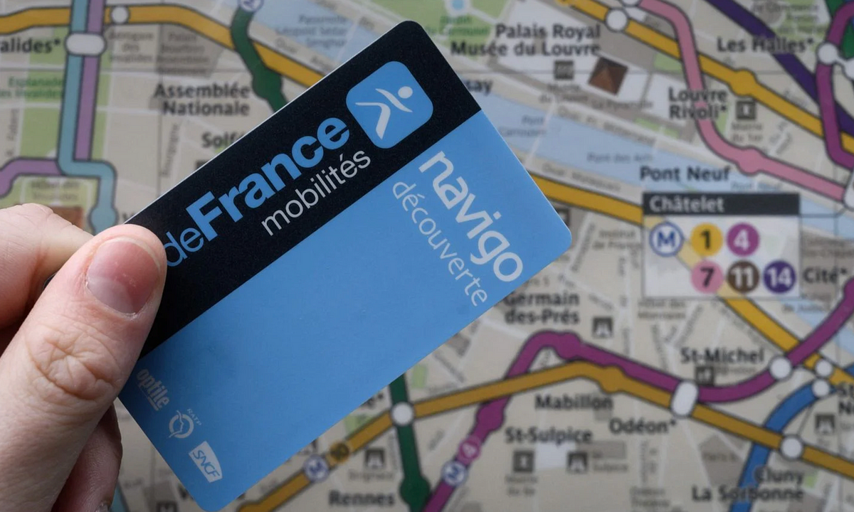
Frustration emerged from misusing a poorly designed app to load transport tickets, leading to penalties not intended by users. Initial confusion about the process resulted in repeated failure and fines, which felt unjust given the design's shortcomings. The app’s inefficiency pointed to a broader issue in user experience design, where the system's flaws led to misinterpretations and frustrations. When users frequently struggle with a service, it indicates a design problem rather than user error, thus reshaping the responsibility for failures.
"We were penalized not because we refused to pay, but because we misunderstood a poorly designed system. Yes, we didn't validate the tickets. But we didn't intend to cheat."
"Design isn't neutral when the consequences are real. If the interface isn't clear, assumes prior knowledge, or silently allows you to do the wrong thing, then it's not "just bad UX" - it's a trap."
"When millions of people use a service for the first time... and regularly make the same mistakes, that's a design problem."
"When they're confusing, incomplete, or rigid, they don't just frustrate - they punish."
Read at Medium
Unable to calculate read time
Collection
[
|
...
]