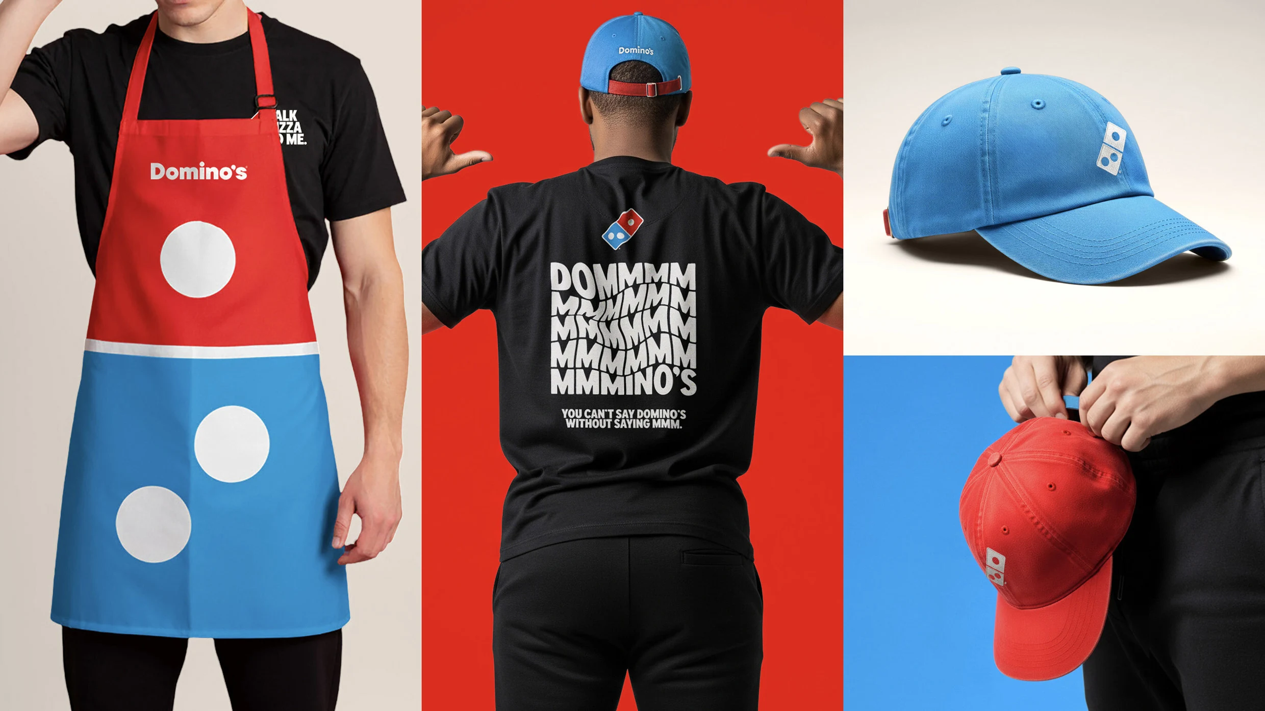
Domino's completed its first brand refresh in 13 years, introducing brighter reds and blues, a new Domino's Sans font described as thicker and doughier, updated team apparel, and redesigned pizza boxes including a black-and-metallic-gold box for premium items. The visual overhaul emphasizes craveability through squishy type and ingredient-forward color choices to make food appear more appetizing. For a new brand asset called the "cravemark," the company elongated the "m" sound in its wordmark and jingle, using musician Shaboozey's drawn-out "m" and an animation that adds extra Ms before forming the domino logo.
"Domino's announced a rebrand Wednesday that includes brighter reds and blues and a new font called Domino's Sans that was designed to "be thicker and doughier" and proves that using sans serifs doesn't have to be bland. Team members will get new branded gear to wear in the kitchen and out delivering orders, and there's a reimagined suite of new pizza boxes, including one black-and-metallic-gold box designed for premium menu items, like Domino's Handmade Pans, to better upsell pricier pizzas."
"For its new tagline-which Domino's is calling it its "cravemark"-they tapped Shaboozey, who draws out the "m" sound when saying "dominos" in campaign ads (like "dommmino's," get it?). On screen, the musician's jingle is visually reinforced with an animation that adds the extra Ms to the Domino's wordmark before the letters snap into the Domino's domino logo."
""Rather than launching a more traditional tagline, we're baking craveability right into our name and every aspect of our brand as a reminder of this relentless focus," Domino's executive vice president Kate Trumbull said in a statement. "You literally can't say 'Domino's' without saying 'mmm.'""
Read at Fast Company
Unable to calculate read time
Collection
[
|
...
]