fromTNW | Launch
1 week agoGraphic design
OpenAI's new image model reasons before it draws
The new AI model generates coherent images, accurately renders text in various scripts, and integrates advanced reasoning capabilities.
The second film adaptation of Hiroshi Sakurazaka's 2004 eponymous novel, this new one is considerably inferior to Edge of Tomorrow from 2014, Tom Cruise's own Groundhog D1ay with mechs. It's not a question of budget or aesthetics simply a gaping hole of engaging characterisation and inner spark that makes this time loop a grinding chore, rather than a thrilling jailbreak from eternal recurrence.
The initial visual explorations began with reliefs, working with a static approach which allowed Saad to focus on how visuals could layer and live together later down the line. After they were sculpted and assembled in 3D animation, Saad began pulling out individual vignettes to explore motion, a key goal "was to keep things both sculptural and kinetic - balancing crafted moments of stillness against bursts of movement".
Visual design increases brand engagement by shaping perception, generating emotion, and enabling brand recognition. Brands like Innocent Drinks use playful illustrations and informal typography to strengthen user connection. Their packaging design increases memorability and brand recall among UK audiences. Colour, typography, imagery, and layout influence how people experience a brand. Colour shapes emotional response. Blue signals trust, red activates urgency, green suggests sustainability. Barclays uses blue to build authority, while Oatly uses earthy tones to align with eco-conscious values.
"Resurrection," a magnificent intoxicant of a movie from the thirty-six-year-old Chinese director Bi Gan, is no ordinary love letter to cinema. It's more like a love labyrinth-a multi-tiered maze, full of secret passages, shadowy rooms, and winding staircases, with a giant movie theatre, sculpted from candle wax, waiting at the incandescent finish. It's an ecstatic, extravagant work of artifice and imagination, and, from the start, Bi and his collaborators (they include the director of photography Dong Jingsong and the production designers Liu Qiang and Tu Nan) embrace their craft with a childlike sense of wonder and play.
In both learning and advertising, one challenge remains constant: capturing attention in a world full of distractions. While Instructional Designers focus on structuring knowledge, advertisers focus on visibility, clarity, and instant comprehension. Surprisingly, the same visual communication principles that make an ad effective can also make eLearning more intuitive, engaging, and memorable. Having worked closely with visual communication in high-traffic environments, I've seen how small design choices influence how people notice, process, and retain information.
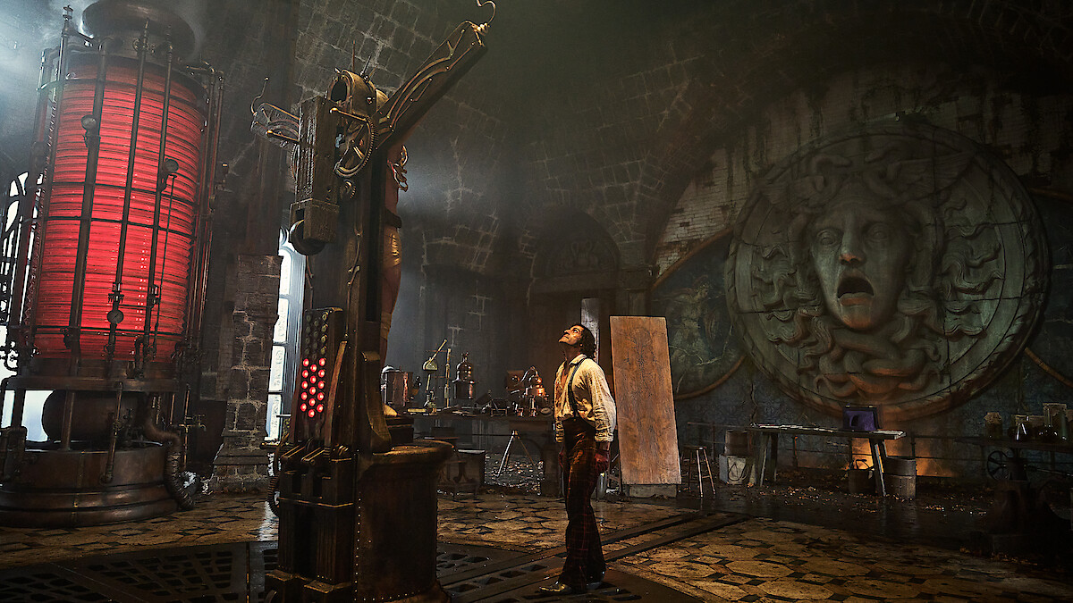
Guillermo del Toro has spent his filmmaking career finding sympathy for monsters. His best-known stories balance compassion and edge. He won the Oscar for Best Picture for The Shape of Water, an aching if gory ballad of an aquatic creature falling in love with a human; his superhero movies focus on fringe characters such as Blade (half-man, half-vampire) and the demonic Hellboy, both outcasts operating in society's shadows.
Called The Tea, Spilled by Morning Joe, the revamped newsletter for the popular morning show on the network that will soon be called MS NOW (the name change is official on November 15, the network says) took its inspiration from the world of print magazines. It's designed to be part of a larger flywheel to grow and connect with the show's audience.
Hey everyone, I have been working on a new website and would love some honest feedback from the community. I have focused on usability, visual balance, and performance, but I'm sure there's room for improvement. You can check it out here:Instagram Story Viewer I would really appreciate your thoughts on the layout, typography, and overall experience anything that stands out as good or bad. Thanks in advance for taking the time!
Diving Into The Latest eLearning Trends And L&D Pro Insights From providing more meaningful feedback that drives employee engagement to mastering AI prompting techniques for instructional storytelling, September's publication calendar was packed with standout guest author submissions. So, we've chosen a few to feature in this roundup. In no particular order, here are last month's top guest author articles. 5 Guest Author Articles To Check Out Today
Text Required For Instructional Design/Development (Internal-Facing Text) Learning objectives Scope and sequence Blueprints for stakeholder sign-off Instructor guides Storyboards and scripts (for multimedia production) Text Required For Instructional Delivery (Learner-Facing Text) Course packaging (e.g., LMS home page) Schedule/syllabus Subject-oriented content (such as assigned textbooks or articles) Activity/assessment instructions User Interface writing for all ungraded practice interactivities Assessments and rubrics Video transcripts, closed captions, and callouts Image titles, captions, and callouts
The thing is, the company I was working for had a dedicated photo team that provided beautiful, high-quality images with numerous contextual and action shots, perfect for web pages. So when what came to my desk was a classic full-page hero of an image with a gradient, I wasn't exactly surprised. But it did frustrate me that we couldn't come up with something more bold.
Financial brands have developed a reputation for being corporate and oftentimes, a little dull, but that doesn't have to be the case. Switching up the stereotype is Tilt, a fintech company focused on empowering people without dwelling on their financial past. The best rebrands strengthen a brand by digging into its heritage and values, creating a new identity that's succinct and strong.
For the second season, we wanted to elevate Arcane's visuals even further while staying true to the elements that captivated audiences in Season One. Riot gave us significant creative freedom, allowing us to collaborate with extraordinary artists. At Fortiche, our ambition is to create 'animated concepts' in every frame. We're deeply committed to delivering a unique viewer experience, crafting stunning visuals, and evoking strong, relatable emotions through immersive directing.
Metal Gear Solid Delta: Snake Eater is a full-blown remake of 2004's Metal Gear Solid 3, completely rebuilding the game using the software Unreal Engine 5. This means a completely overhauled visual style, a new over-the-shoulder gameplay mode, and a mix of other changes. But Delta falls into that bizarre middle ground as a remake, stretching the definition of the word. It's a game singularly focused on "preserving" the experience of the original, and because of that, a lot of the additions feel like afterthoughts.
The ad in question features an image of a blonde girl squatting on a lantern-lined street, supposedly sporting the new Skechers 'Uno' sneakers. With AI's signature faux-sketch style, paired with the girl's generically beautiful 'Instagram face', the design has all the hallmarks of a basic AI image.
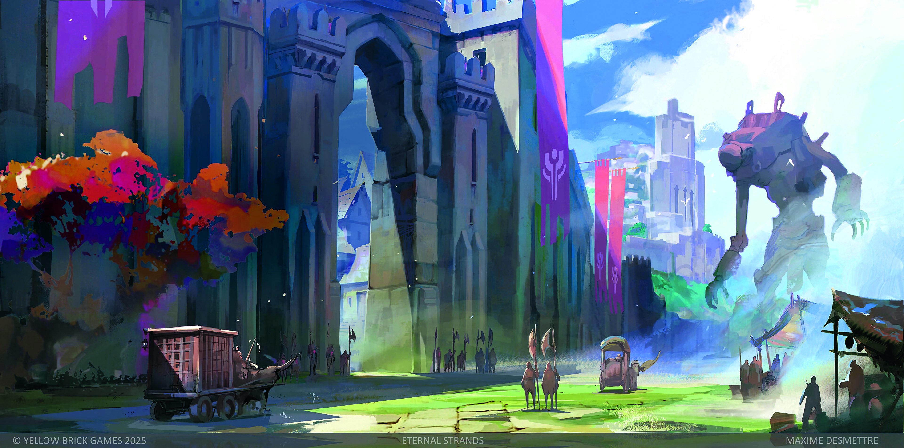
Nirvana Noir innovatively contrasts its predecessor's monochrome aesthetic with vibrant, psychedelic visuals, exploring a metaphysical metropolis shaped by the consequences of the Big Bang.