#typography
#typography
[ follow ]
#branding #css #accessibility #graphic-design #design #type-design #visual-identity #visual-design #motion-design
fromItsnicethat
1 week agoTemplo's brand identity for climate non-profit Casi draws on the pragmatic mark making of hieroglyphics
"The subversive simplicity of hobo hieroglyphics - the chalk markings left by people travelling through America during the Great Depression - are rooted in pure pragmatism: quick, direct signals that connect people to one another and to the landscape."
Typography
fromItsnicethat
1 week agoRiz Ahmed's new show Bait has a spy-spoof title sequence masterminded by Pentagram partners
"Given the impetus of the plot involves James Bond - the world's most famous spy - undertones of the genre of intelligence and espionage are alluded to, in both the choice of a monospace typeface, ABC Rom Mono, and in the widely tracked, code-like setting of it."
Television
Typography
fromItsnicethat
1 month agoBritpop to Breaking Bad: This book proves just how culturally iconic the Clarks brand is
Clarks evolved from Quaker restraint to embrace visual communication through advertising and design, becoming a culturally significant brand adopted by diverse subcultures worldwide.
Typography
fromFast Company
2 months agoPeople can't read the lettering on the Obama Presidential Center tower
The Barack Obama Presidential Center's tower features intentionally difficult-to-read lettering designed as textural architectural element rather than readable text, prioritizing visual impact over legibility.
fromEntrepreneur
2 months agoHow to Design a Logo That Lasts 10+ Years
Creating a logo for your business takes tremendous planning, research and thorough execution. Your logo is a lifelong part of your business, so make sure it represents you well. Whether you are hiring a professional creative agency or you decide to do it yourself, I want to shed some light on a few central elements to this process. The key to a great logo is to create something timeless.
Typography
fromItsnicethat
2 months agoWho Owns This Book? The guide for every designer's worst nightmare: copyright
"There's a tension in the design of the book that I was exploring, between making it feel super contemporary and colorful, and leaning into more traditional aesthetics of archives and historical content. I wanted to honor both," says Michele. "Copyright law can also be kind of intimidating, so I wanted to use the design of the book to make the content more approachable and engaging."
Typography
fromdesignyoutrust.com
2 months agoThis Artist Creates Superhero and Comic Watercolors With Traditional Japanese Motifs
Justin Bieber for Calvin Klein Spring 2015 Ad Campaign In A Parallel Universe: Artist Exposes Sexism By Switching Up Gender Roles In Old-School Ads Russian Blogger Makes Parodies Out Of Celebrity Photos, And More Than 20,000 Followers On Instagram Approve 10 Famous Movie Titles Written Using Negative Space The World of Modern Graphic Design & Typography by Kyle Kemink Chinese Tech Companies Hiring 'Pretty' Girls to Motivate Male Employees by Chatting, Playing Ping Pong and Buying them Breakfast
Typography
fromItsnicethat
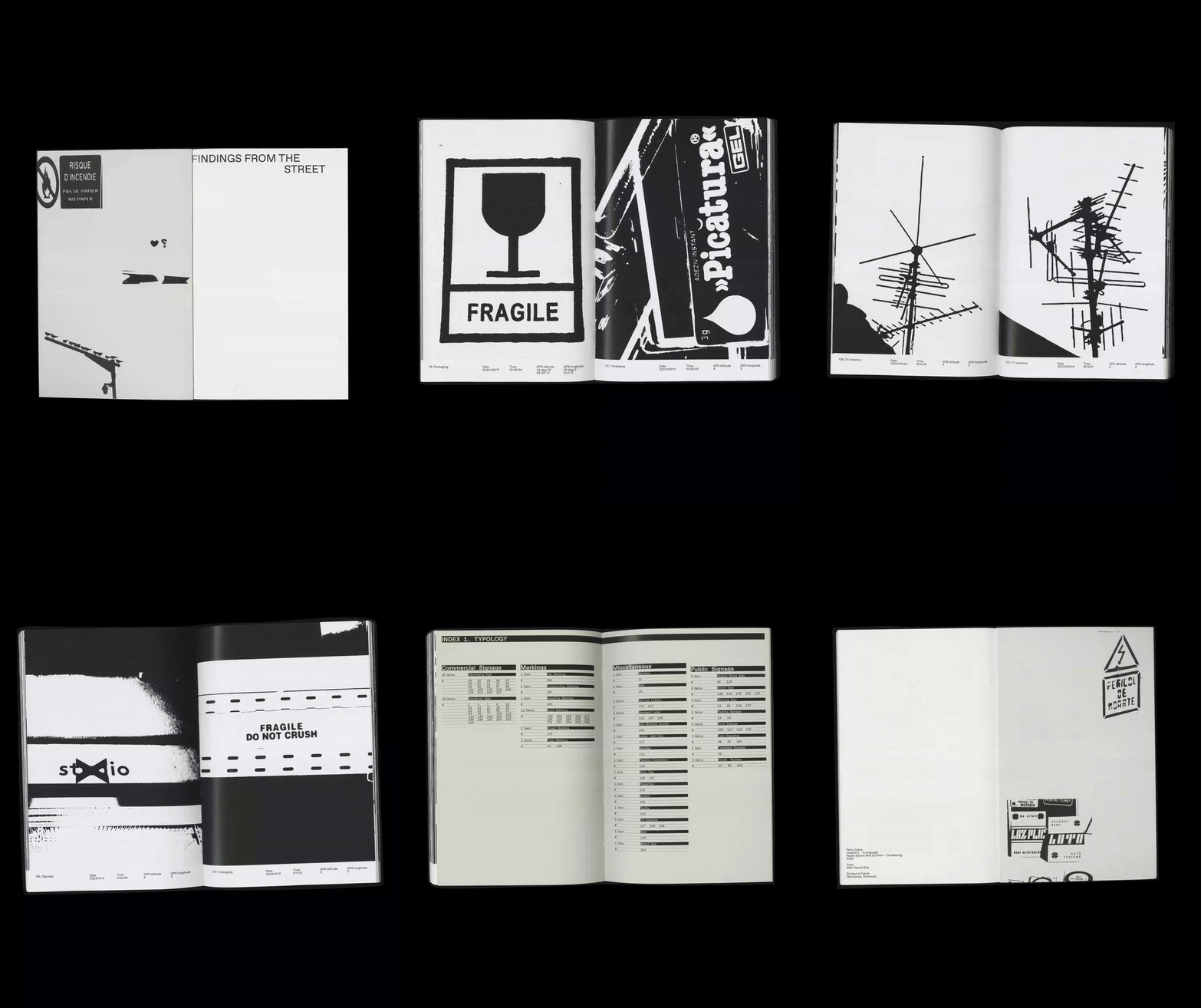
2 months agoThe experimental graphic design work of Ward Goes sits at the intersection of type and materiality
A graphic designer that isn't limited to working in 2D, Ward Goes has been working in aluminium of late. His recent solo show in Rotterdam, Literally Anything, was full of things that moved beyond the screen or printed page, including some wonderful metal signage and archival storage. The exhibition at Alley Space was the result of the designer's decision to pursue more tactical investigations alongside his commissioned work at the start of 2025.
Typography
fromItsnicethat
2 months agoHow sign painting underpins Sean Thomas' approach to bespoke branding projects
If you're based in London, you've probably walked past one of Sean Thomas' meticulously hand-painted designs. Whether that was grabbing a sandwich at Dom's Subs, dining in at Forza Win (an Italian restaurant in Peckham that the designer has shaped the visual identity of over the last three years), or picking up a copy of Hoxton Mini Press' new book on Britain's best bakeries at your local bookshop.
Typography
fromI Love Typography Ltd
4 months ago10 Must-have Typefaces for 2026 - I Love Typography Ltd
Our Must-Have Fonts for 2025 list was our most popular ever, but our must-have fonts for 2026 list aims to set the bar even higher. Finding the best typefaces among thousands can be pretty daunting! So, to make things easier, we've curated a list of outstanding must-have typefaces for the coming year. The ten font families in the list share something important in common - an explicitly human touch, not machine-made or prompt-produced, but born from human minds and crafted by human hands.
fromI Love Typography Ltd
6 months agoSteven Heller's Font of the Month: OTC Textura - I Love Typography Ltd
Blackletter typefaces elicit many contradictory emotions depending, of course, on the context in which they are used and the manner in which they are composed. Sometimes they bark commands - STOP or BEWARE. Other times they are comforting in an ecclesiastical way - Christmas and Easter greetings. During World War II Blackletter was menacing for those in occupied lands who read it as exclusionary - as in FORBIDDEN or DANGER; others accepted it as patriotic
Typography
Typography
fromItsnicethat
3 months agoDeborah Khodanovich's font honours the most trivialised form of communication - gossip
Gossip functions as a communal craft that preserves values, enables care, evades censorship, and challenges patriarchal control through informal, untraceable conversation and typographic reclamation.
fromItsnicethat
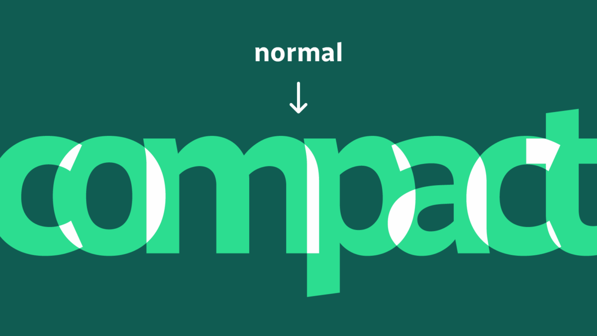
3 months agoMonotype's logo for lingerie brand Chantelle Pulp takes on different weights to celebrate all shapes and sizes
Monotypes logotype couldn't just exist in one static state - "ideas of diversity, adaptability, and boundary-pushing were central to the creation of the variable logo from the start," says Daniel. Collaborative workshops, sketching sessions and exchanges with Chantelle's global chief creative officer, Renaud Cambuzat, and head of design, Natalia Kotkowska, cemented into the idea for a shapeshifter logo capable of morphing its look through different weights and shapes.
Typography
fromBusiness Matters
4 months agoBoosting Brand Engagement Through Smart Visual Design
Visual design increases brand engagement by shaping perception, generating emotion, and enabling brand recognition. Brands like Innocent Drinks use playful illustrations and informal typography to strengthen user connection. Their packaging design increases memorability and brand recall among UK audiences. Colour, typography, imagery, and layout influence how people experience a brand. Colour shapes emotional response. Blue signals trust, red activates urgency, green suggests sustainability. Barclays uses blue to build authority, while Oatly uses earthy tones to align with eco-conscious values.
Design
from9to5Google
4 months agoGoogle recaps the road from Product Sans to open-sourcing Google Sans Flex
Due to the 2015 Google logo redesign, the company created Product Sans to update hundreds of product lockups, or the "fixed arrangement of the logo paired with each product name" that you might see in the top-left corner of apps. It was "based on the clean geometric forms of the new logo," with the new "font's repeating geometric shapes and tightly spaced characters made it perfectly suited for big product names at big sizes."
Typography
fromJezebel
4 months agoHelvetica is Too Woke for Marco Rubio, Apparently
In a cable dated December 9 and obtained by Reuters, Rubio reportedly wrote: "To restore decorum and professionalism to the Department's written work products and abolish yet another wasteful DEIA program, the Department is returning to Times New Roman as its standard typeface." (The subject line of the directive is, "Return to Tradition: Times New Roman 14-Point Font Required for All Department Paper.")
US politics
fromIntelligencer
4 months agoNow the Trump Administration Is Coming After Our Fonts
If I had to pick a word to describe Calibri, the sans serif typeface which was the default font for Microsoft apps from 2007 to 2024, it would probably be "inoffensive." Sure, Microsoft's "extremely readable" font has had its critics over the years, but they've mostly just complained that it's too plain, that it lacks personality. I'd bet that for most people, Calibri just became a ubiquitous, thoughtless part of their normal life, from office memos to book reports,
US politics
fromAlways Twisted
5 months agoGenerating Utility Classes from Design Tokens using Style Dictionary
This article shows a practical pattern for generating utility classes in CSS I've used in one form or another since 2016. Utility classes can give us a fast, consistent way to apply design system values in markup, without sprinkling hard‑coded styles across your project. As I discussed in my article on Creating Design System Friendly Snowflakes with Utility Classes, utility classes can really help offer a middle ground between rigid components and completely custom CSS.
Design
Typography
fromItsnicethat
4 months agoA tactile history of typography comes alive in Kelli Anderson's new book Alphabet in Motion
Tactile, hands-on interactions with paper and obsolete technologies enable deeper understanding, empathy, and personal empowerment in learning and experiencing letterforms.
US politics
fromJezebel
4 months agoType Artist Who Created the Font the White House Now Uses Says 'Fuck Trump'
The White House redesigned its website on January 20 using Instrument Serif and Instrument Sans, fonts co-created by Jordan Egstad and Rodrigo Fuenzalida, prompting personal and political reactions.
fromwww.creativebloq.com
5 months agoIs it just me, or is this font suddenly everywhere?
During the flat design boom of the 2010s, blocky sans-serif fonts were everywhere. Crisp, clean text adorned websites and shopfronts, with more decorative serif fonts seen as fussy and passe. But the tide appears to have turned on the serif vs sans serif debate. From protein bars to sneaker ads to AI brands, it seems everybody is embracing retro typographical aesthetics.
Typography
fromAuldenglish
5 months agoAuld English fonts: A Sea-Change in the Look of Language by Nick Shinn
Today's English alphabet is unchanged since the 16th century-with one exception: the long‑s fell from use circa 1800. Previously, there had been two forms of the letter /s: a long (tall) version at the beginning and in the middle of words, and another, our present‑day /s, at the end of words. The reform used the terminal version throughout. There are two theories as to why this occurred, neither satisfactory.
fromItsnicethat
5 months agoPentagram design Mozilla's new internet-savvy editorial platform Nothing Personal
The NP. mark is "deliberately simple", focusing on a character that comes from its behaviour rather than its look. "It often overlays imagery, not to obscure but to create another layer of meaning. It becomes both a window and a veil, echoing how identity functions online - always present, always mediated," says Natasha. The colour system is bright and "contrasty", creating tension and urgency,
Typography
fromMission Local
5 months agoWhat's on now at San Francisco museums, November 2025
There's a lot going on here. Through this weekend, there is a Behind-the-Screams Tour, where guests will face skeletons, parasites, bloodsuckers, and more from the collection. The newly renovated Wilson Family Nature Lab is opened in mid-October with lots of hands-on learning. Coming up on Nov. 22, there is a one-night only Welcome Winter Night, with two baby reindeer (and a naming contest), magic shows, and lots of other activities.
Typography
fromMedium
6 months agoTypography Basics
Typography isn't just about picking a pretty font. It's the craft of shaping written language into a visual experience - how words look, breathe, and interact on a page or screen. Good typography quietly guides the reader, while poor typography shouts for attention in all the wrong ways. Every detail - from letter spacing to line height - affects how users read, feel, and engage.
Typography
fromwww.sitepoint.com
6 months agoKindly Give Your Precious Feedback on my new website design
Hey everyone, I have been working on a new website and would love some honest feedback from the community. I have focused on usability, visual balance, and performance, but I'm sure there's room for improvement. You can check it out here:Instagram Story Viewer I would really appreciate your thoughts on the layout, typography, and overall experience anything that stands out as good or bad. Thanks in advance for taking the time!
UX design
fromItsnicethat
6 months agoMagazine C is an ergonomic study of iconic chairs as cultural touchstones
Editorially, the magazine has a modern visual style that is as elegant as the chairs it features. Each issue promotes simplicity and ease in its reading style, opting for uncluttered information - a type of ergonomic reading experience that matches well to the serenity of sitting in a comfortable chair or the act of appreciating the artistic value of furniture. It's academic content with an accessible, contemporary visual voice.
Design
fromMedium
6 months agoYour Product Looks Amateur. It's Probably Your Fonts
Let's be real. You could have the most revolutionary product in the world, but if it looks like a clown car of random fonts, nobody will take you seriously. They'll feel it in their gut. "This looks cheap. This feels untrustworthy." Good design is about building trust. And the foundation of clean, trustworthy design is typography. The good news? You don't need a design degree to get this right. You just need to stop making one critical mistake: using too many damn fonts.
Typography
fromItsnicethat
6 months agoThis collaborative typeface made from coloured tape is called... (you guessed it) Tapeface
"It's an amazing idea, and it's surprising that it hasn't knowingly been done before. "Tape felt like the perfect tool to disrupt typographic tradition. It's fast, tactile, and unruly," says Varanda. "What fascinated me most was how tape could act as both a restriction and a liberation. It forces letterforms into sharp edges, but in the hands of 27 participants, it created shapes that I could never have imagined alone."
Typography
fromPangram Pangram Foundry
7 months agoHow to create a typographic hierarchy
No matter what you're designing for - maybe it's a website? A brand? A magazine, perhaps? - typographic hierarchy is your foundation, your building blocks. It's what guides your reader through your website, brand or book. It tells them what to look at first, what to skim, and what to remember. Done right, it's seamless. Done wrong, it can be extremely confusing.In short, hierarchy is how you visually structure information. Here's how to do it well.
Typography
[ Load more ]


