Graphic design
Graphic design
[ follow ]
#omicron #challenge #logo-design #graphic-libraries #inclusive-design #screen-reader #blending-power


Graphic design
fromdesignboom | architecture & design magazine
15 hours agohiggsfield brings art-directed quality to AI image generation at production scale
Higgsfield's Soul 2.0 revolutionizes AI photo generation for the creative industry, enhancing visual quality and efficiency in producing artistic imagery.
fromdesignboom | architecture & design magazine
19 hours agoblooming graphics and floral installations take over shinsegae department store for spring
The campaign explores the relationship between graphic identity and natural motifs, with the S-check pattern reinterpreted through cherry blossom imagery, establishing a contrast between graphic order and natural variation.
Graphic design
fromGame Informer
in 3 weeksInvincible VS Art Director Talks Creating The Game's Visual Style, Toughest Fighter To Design, And Working With The Series Creators
Whenever you're working with an existing IP, there's always the question of how you're going to translate and adapt, right? Because it's not a one-to-one sort of interpretation.
Graphic design
#generative-ai


Graphic design
fromLondon Business News | Londonlovesbusiness.com
2 weeks agoWhy generative AI is becoming a major innovation trend - London Business News | Londonlovesbusiness.com
Generative AI has become a major engine of digital innovation, enabling businesses across sectors to create realistic content, automate processes, and pursue new digital opportunities through advanced machine learning and neural networks.
fromWWD
1 day agoAdidas' Newest Originals Flagship Centers Around NYC's Creative Community
The new store preserves the building's historic character-keeping original brick walls exposed-while layering in contemporary materials such as metallic finishes, reflective surfaces, and semi‑gloss flooring.
Graphic design
Graphic design
fromItsnicethat
2 days agoCalifornia Dreaming: The latest issue of A Rabbit's Foot is about the inventors and innovators of our movie-making culture
A Rabbit's Foot magazine celebrates the future of film and artistic craftsmanship while exploring California's innovative cultural landscape.
Graphic design
fromdesignboom | architecture & design magazine
4 days agowinner announced for All-New Nissan MICRA global design competition
Marc-André Fauteux wins the Elevate the All-New Nissan MICRA competition with a design emphasizing organized simplicity and a striking asymmetric visual language.

Graphic design
fromThe Art Newspaper - International art news and events
1 week agoSwimming pools and school rules: artist Chan Wai Lap on the unusual themes behind his installations
Chan Wai Lap explores the structured environment of public swimming pools through art, focusing on their visual order and social dynamics.

Graphic design
fromdesignboom | architecture & design magazine
1 week agoinside archigram's radical, sixties-era vision for cities that evolve as fast as we do
Archigram created a radical vision of architecture focused on flexibility, mobility, and imagination, influencing design without ever constructing physical buildings.
fromwww.kaltblut-magazine.com
2 weeks agoIsaac Yu's Serious Puzzle Reimagines Contemporary Menswear in Atlanta Downtown Through Military Structure and Child Collage
Isaac Yu's work is recognized for its experimental approach to oversized silhouettes and innovative use of denim textiles, often infused with playful elements inspired by childhood imagination.
Graphic design
fromwww.fourfourtwo.com
2 weeks agoThe Japan World Cup 2026 away kit is out - and it's a contender for kit of the year
The differently colored stripes symbolise 'Colours Beyond the Horizon', with the stripe graphic featuring 12 colours: 11 colours representing each player, while the central red stripe symbolises the Japanese football family, which is a really nice added touch.
Graphic design
Graphic design
fromItsnicethat
2 weeks agoThese emotionally charged illustrations are here to make your imagination wander
Xiao Hua Yang creates illustrations that blend digital and analogue techniques to suggest emotions through subtle imagery rather than explicit statements, prioritizing implication over explanation.
Graphic design
fromForbes
2 weeks agoTracee Ellis Ross Brings Play Into Office Design. It Works
Tracee Ellis Ross designed her West Hollywood office as a creative ecosystem blending modernist furniture with warm, expressive pieces to create an inviting workplace that encourages different types of work.
#dlss-5
Graphic design
fromKotaku
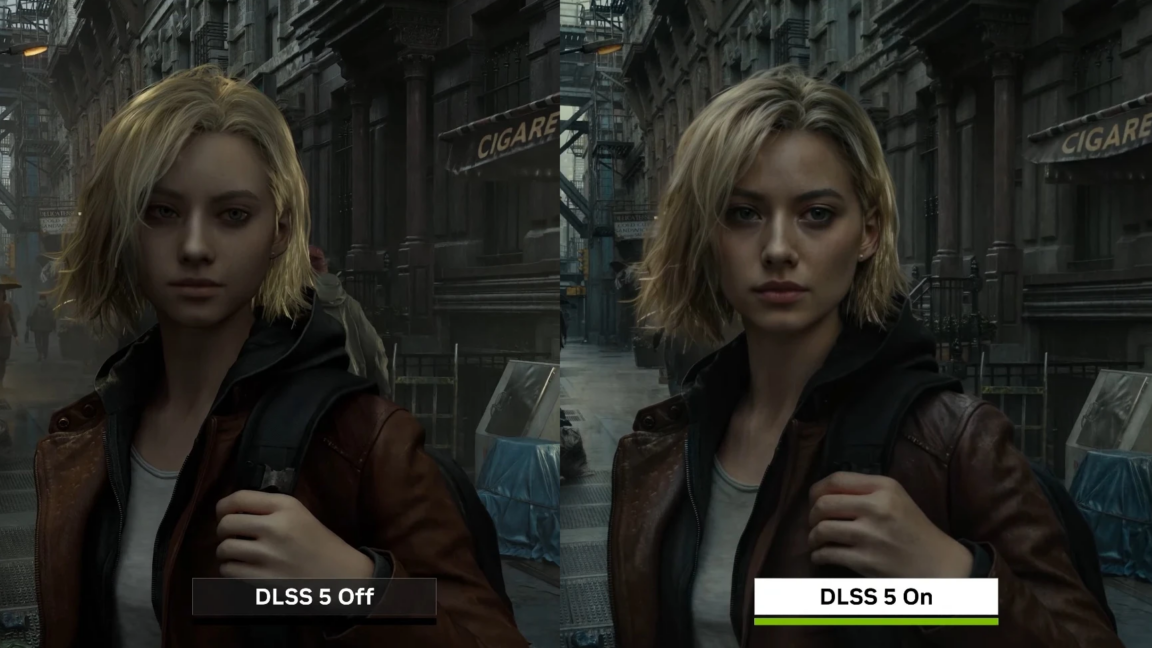
2 weeks agoNvidia Says DLSS 5 Haters Just Don't Get How The Gen AI Works
Nvidia CEO Jensen Huang defends DLSS 5 generative AI upscaling technology against backlash, asserting developers retain full artistic control through fine-tuning capabilities at the geometry level rather than post-processing.
Graphic design
fromKotaku
2 weeks agoNvidia Says DLSS 5 Haters Just Don't Get How The Gen AI Works
Nvidia CEO Jensen Huang defends DLSS 5 generative AI upscaling technology against backlash, asserting developers retain full artistic control through fine-tuning capabilities at the geometry level rather than post-processing.
fromColossal
2 weeks agoFolklore and Nature Converge in Cat Johnston's Expressive, Eccentric Puppets
Drawing on childhood memories, folk art, and nature, the London-based illustrator and model maker creates expressive sculptures and puppets that inhabit dreamlike realms. Invoking historical costumes and cartoonish and emotive faces, Johnston's otherworldly cast seems both familiar and strange, as if children's book protagonists have sprung to life or converged with a strange dream.
Graphic design
Graphic design
fromDaily Coffee News by Roast Magazine
2 weeks agoDesign Details: True to Roots with Cravens Coffee in Spokane
Cravens Coffee's new packaging design modernizes the brand while grounding storytelling in coffee origins, farmer relationships, and agricultural heritage through custom illustrations and meaningful messaging.
Graphic design
fromWWD
2 weeks agoPinterest Alternative Cosmos Is Looking to Redefine Visual Inspiration for Creatives
Cosmos, a visual inspiration platform founded by Andy McCune, raised $15 million in Series A funding and became Apple's top design app in 28 countries by solving creatives' need for centralized visual reference management.
fromdesignboom | architecture & design magazine
2 weeks agocritical futures: how superflux draws upon speculative designs to transform our present
The most effective way to change what people do today is to make them experience what tomorrow can look like. They illustrate details backed by data, science, and facts, allowing their imagined futures to no longer stand as theories but as actionable methods. Where forecasting extends from data, speculative design builds from imagination, supported by research.
Graphic design
Graphic design
fromTechCrunch
2 weeks agoGamma adds AI image generation tools in bid to take on Canva and Adobe | TechCrunch
Gamma launches Gamma Imagine, an AI image-generation product for creating brand-specific marketing assets, positioning itself between professional design tools and legacy presentation software.
Graphic design
fromdesignboom | architecture & design magazine
2 weeks agoelevate the all-new nissan MICRA global design competition reveals the finalists
Nissan and designboom announced 11 finalists for the Elevate All-New Nissan MICRA design competition, where creatives reinterpreted the car's exterior identity through color, graphics, patterns, and materials while preserving its original structure.
Graphic design
fromYanko Design - Modern Industrial Design News
2 weeks agoRed Bull Just Put a Playable Tetris Game on a Magazine Cover - Yanko Design
Red Bull's GamePop magazine cover integrates playable Tetris through a flexible circuit board thinner than human hair, demonstrating innovative print media that merges physical and interactive gaming experiences.
fromItsnicethat
2 weeks agoAbstracted organica: The design trend taking root in Naarm, and the designers doing it best
The ridges of eucalyptus bark, the geometries of shell formations, moss-covered trees, Indigenous grasslands and the hidden networks of fungi beneath the soil. These landscapes produce organic yet abstract patterns - natural systems that quietly shape the way we see and design the world around us.
Graphic design
Graphic design
fromdesignboom | architecture & design magazine
2 weeks agoutopia, applied, or, why we have to change to stay the same
Utopia functions as a thinking tool for imagining and reshaping present reality, not as an unreachable destination, driving progress through critique and radical imagination.
fromwww.bbc.com
2 weeks agoRace on to establish globally recognised 'AI-free' logo
AI is creating significant disruption and competing definitions of what is 'human made' are confusing consumers. A universal definition is essential to build trust, clarification and confidence. Without standardization, consumers face confusion distinguishing between genuinely human-made products and those using AI, undermining the credibility of the entire certification movement.
Graphic design
fromItsnicethat
2 weeks agoChristopher Mcholm's child-like drawings are about first kisses, kissing each other and kissing forever
I love love, that's why his drawings often include figures, animals and even flowers hugging and kissing. Doesn't it feel good to be loved? Hot-dang, I know so - so my drawings express my love for love, especially for the ones we love.
Graphic design
fromItsnicethat
2 weeks agoDaniel Savage on the irony of using a robot to make something that feels more human
Daniel Savage walked us through some of the material experimentations that led to the development of his distinct animation style. The designer demonstrated how his use of the pen plotter as more of a printmaking process has allowed his animations to become more than just films, shaping editorial illustration commissions for The New York Times as well as his new artist book Something Savage, published by Vitra editions.
Graphic design
Graphic design
fromElite Traveler
2 weeks agoHow a London Atelier Is Reimagining the Globe for Modern Collectors
Bellerby & Co. revives traditional globemaking as a bespoke craft, combining cartography, painting, woodworking, and metalwork to create handmade globes that symbolize intellect and curiosity in an era rejecting disposable consumer culture.
Graphic design
fromHi-Fructose Magazine - The New Contemporary Art Magazine
3 weeks agoIn Blob We Trust: The Art of KRK Ryden - Hi-Fructose Magazine
KRK Ryden's vibrant, chaotic home studio and colorful paintings reflect his artistic philosophy of controlled chaos organized by color, pattern, and theme.
fromwww.fourfourtwo.com
3 weeks agoThe Brazil World Cup 2026 away kit is out - and it's a bold step away from tradition
The new design features a streaked old royal' blue pattern on a black base, but leaves much of the central area beneath the badge plain. Neon yellow highlights adorn the shoulders, matching the badge, whilst there are teal tinges in the side panels. A little Vai Brasa' (Go, Brazil) logo on the inside of the collar is a nice touch.
Graphic design
fromESPN.com
3 weeks agoBrazil's stunning away kit to be Jordan's first at World Cup
Brazil have joined forces with the Jordan brand to create what will be one of the coolest kits on show at the 2026 FIFA World Cup this summer. The Seleção's latest jersey has been designed in collaboration with the Nike offshoot label, who have forged a similar relationship with Paris Saint-Germain in 2018 that has spawned a cavalcade of fashion-conscious kits for the reigning UEFA Champions League holders.
Graphic design
[ Load more ]