#minimalist-monogram
#minimalist-monogram
[ follow ]
#design #typography #user-experience #home-decor #product-design #interior-design #minimalism #design-systems

fromDesign Milk
1 week agoTSATSAS Unveils a New Hue for the 931 Bag by Dieter Rams
I designed this bag in the same way I designed everything else, so largely based on right angles, but perhaps a little more emotionally, more personally. Designing a handbag is undoubtedly different to designing a Braun stereo system, but I applied the same principles. It had to be functional, visually durable, and very aesthetic. Less, but better.
Fashion & style
#scandinavian-design
Design
fromYanko Design - Modern Industrial Design News
2 weeks ago5 Scandinavian Product Trends That Will Make Your Home Instantly Feel Like Hygge - Yanko Design
Scandinavian design emphasizes clean lines, natural materials, and functionality, creating a harmonious balance between aesthetics and practicality.
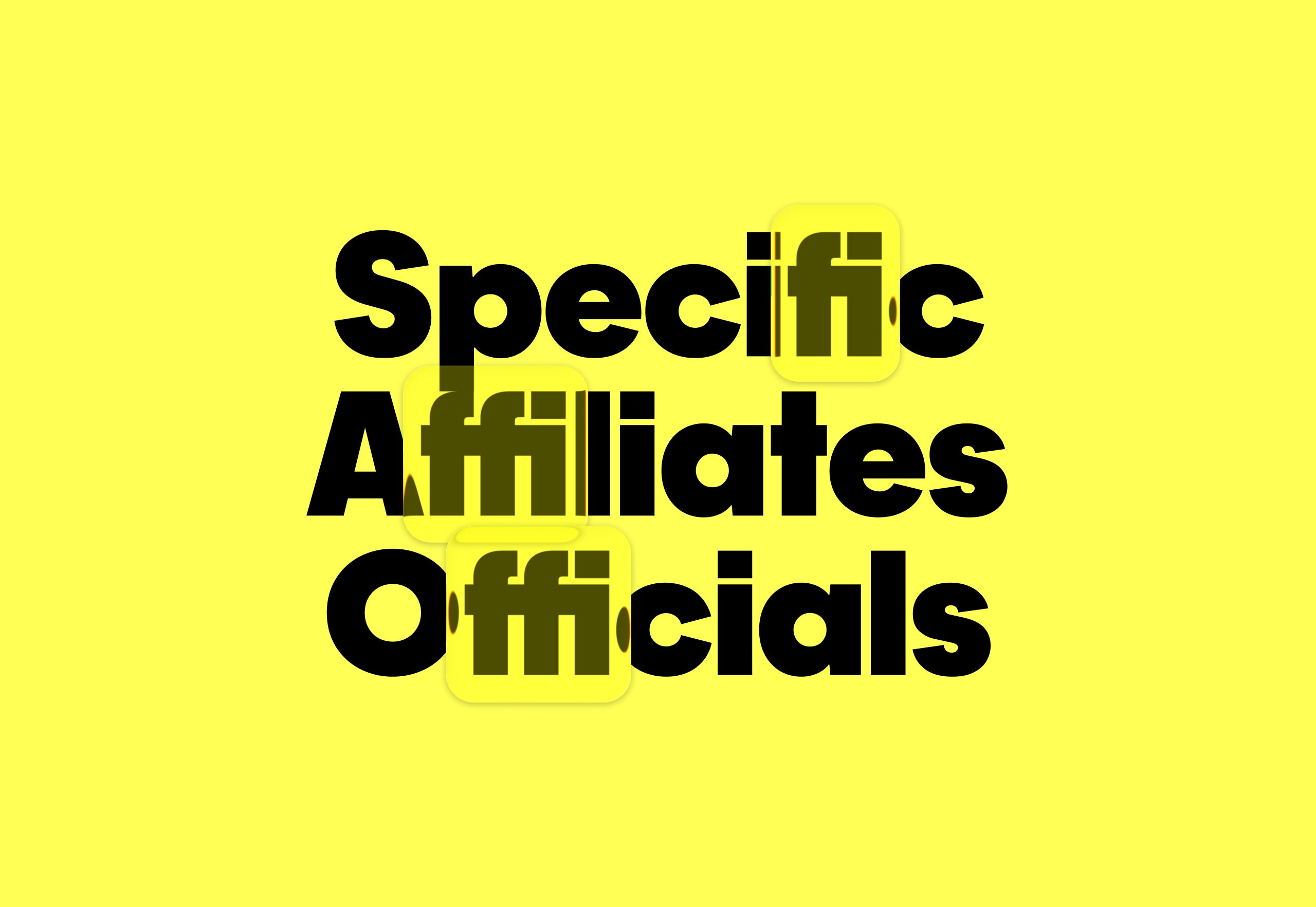
#typeface-design
Typography
fromI Love Typography Ltd
1 month agoSteven Heller's Font of the Month: Curve Display - I Love Typography Ltd
Curve Display is a Didone-inspired display font that balances classical elegance with experimental, abstract letterforms, making it distinctive yet accessible for contemporary graphic design.
Design
fromdesignboom | architecture & design magazine
4 weeks agoa rich palette of saturated hues meet industrial precision in mara's renewed digital identity
Mara enters 2026 as a global interior design protagonist, expanding from office and hospitality into residential markets while strengthening its digital identity and sustainability commitment.
Typography
fromItsnicethat
1 month agoEleanor Yang merges the synthetic and organic to make typography you can touch
Synthetic Nature presents three typefaces—DNA, Mesh, and Data—that metaphorically represent life through biological, network, and computational structures, exploring how biology, computation, and culture merge.
Design
fromYanko Design - Modern Industrial Design News
1 month ago5 Floating Designs That Look Like Photoshop (But They're Real) - Yanko Design
Floating design lifts architectural elements from the ground to create visual lightness, spatial clarity, and refined interventions that balance engineering precision with aesthetic intent.
Gadgets
fromYanko Design - Modern Industrial Design News
1 month ago5 Best Desk Accessories That Turn Your Workspace Into a Minimalist Studio - Yanko Design
A deliberate, minimalist desk filled with purposeful, well-designed accessories inspires focus and reshapes how work is done by blending beauty with functional craftsmanship.
fromItsnicethat
1 month agoAbstracted organica: The design trend taking root in Naarm, and the designers doing it best
The ridges of eucalyptus bark, the geometries of shell formations, moss-covered trees, Indigenous grasslands and the hidden networks of fungi beneath the soil. These landscapes produce organic yet abstract patterns - natural systems that quietly shape the way we see and design the world around us.
Graphic design

fromSubstack
1 month ago20 Design Reference Platforms Beyond Dribbble
Static images don't show motion. You can't inspect real product structure. You don't see how interfaces evolve over time. You rarely understand what actually works in production. So I decided to go deep. I reviewed every major design reference platform I could find - not just the popular ones - and analyzed how they actually help in real-world work. The conclusion?
Mobile UX
fromMedium
2 months agoDesigning useful ads
We've both fought against needless promotional content before and lamented that frontier AI platforms are falling into the same pattern. As designers and users, we've learned that "free" usually means putting up with interruptive, slightly creepy ads that feel more like a tax than a benefit - a frustration tax that now colors how we approach free‑tier services and now AI tools.
Artificial intelligence
fromItsnicethat
2 months ago"A scrapbook of raw, layered process, inspiration and practice": Dixon Baxi on their 500-page manifesto for making
"We started by asking everyone to collect images regularly. Just spontaneous snapshots as we went. Of everything. Sketches, screens, notes, half thoughts, moments in motion. Over time it became this huge grab bag of elements," Simon says.
Books
Graphic design
fromItsnicethat
1 month ago"A poster is a bit like a song": Jakub Zasada's geometric works are a thing of beauty
Jakub Zasada creates midcentury-inspired digital posters using minimal software functions and scanned materials, prioritizing functional design for public spaces with universal accessibility.
fromFast Company
1 month agoThe Getty's new logo is a blocky tribute to its vast collections
We needed a visual identity that was uniquely Getty and distinct enough to unify how we show up globally. This system gives Getty one clear, ownable expression in support of the work we do around the world.
Typography
fromblog.logrocket.com
2 months agoLinear design vs. minimalism, brutalism, and neumorphism - LogRocket Blog
Linear-style UIs look simple, but the theming system has to do real work. Here's how to meet WCAG 2.2 contrast requirements across light, dark, and high-contrast modes whether you're using a UI library or rolling your own tokens.
UX design
fromMedium
3 months agoClarity or Conformity? Rethinking the Rules of Content Design
In Andor, I got chills when Mon Mothma warns the senate of a chilling truth: When we let noise, conformity, or fear dominate, we lose sight of what matters. We risk allowing the loudest voices, often the safest, the most predictable, to drown out individuality, identity, and truth. To me, this line... This line echoes a growing tension I feel in content design.
UX design

fromTasting Table
2 months agoThese Neutral Kitchens Prove That Less Is Sometimes More - Tasting Table
But as everyone is chasing micro-trends, choosing a neutral kitchen and following your personal style comes across as more wise and timeless than ever. As seen in the 10 neutral kitchens below, hues like whites and off-whites, blacks, grays, beiges, and earth tones can be combined in infinite ways and applied to different textures and materials, to create kitchens that are dynamic, clean, and classy all at once.
Design

Graphic design
fromdesignyoutrust.com
2 months agoLi Zhongzheng Turns Modern Calligraphy Into Chunky Neon Lettering Pulsing With Sci-Fi Volume
A curated collection presents diverse contemporary visual art and design works, ranging from illustrations, photography, sculptures, and creative redesigns to unconventional materials and playful reinterpretations.
fromYanko Design - Modern Industrial Design News
2 months ago5 Interior Design Trends That Just Made Minimalism Obsolete in 2026 - Yanko Design
Architects today see the home as more than just a place to live. It is now understood as a space that affects how people think, feel, and live each day. By 2026, the field has clearly moved away from cold, uniform minimalism. Instead, design choices such as color, shape, and proportion are made with clear intent, helping to create spaces that support everyday life.
Design
fromblog.logrocket.com
2 months agoWhich UI libraries/frameworks support the Linear aesthetic? - LogRocket Blog
Teams often use customer and user interchangeably until it breaks alignment. Here's how separating the two clarifies research, prioritization, and messaging across B2C, B2B, and B2B2C products.
UX design
fromI Love Typography Ltd
5 months agoILT Blog Redesign - I Love Typography Ltd
The main problem with the existing homepage was that, besides the most recent posts, other content, once it aged and 'fell off' the front page, was then difficult to discover. The new design makes more use of available screen 'real estate', is visually much richer, and reorganizes 18 years of posts, so that even older long-forgotten posts are more easily found.
fromI Love Typography Ltd
2 months agoSteven Heller's Font of the Month: Cattivo - I Love Typography Ltd
Infused with history, the slab cannot help but suggest the old West's frontier clichés, for such ephemera as classic wanted posters, political broadsides, cautionary warning signs, and more generic commercial applications. Cattivo is a brand-new 18-font family that, when used in any weight and size, cuts through nostalgic predictability and provides a welcome alternative to such popular Egyptian-style slab serifs as Stymie and Memphis.
Typography
fromItsnicethat
2 months agoThe experimental graphic design work of Ward Goes sits at the intersection of type and materiality
A graphic designer that isn't limited to working in 2D, Ward Goes has been working in aluminium of late. His recent solo show in Rotterdam, Literally Anything, was full of things that moved beyond the screen or printed page, including some wonderful metal signage and archival storage. The exhibition at Alley Space was the result of the designer's decision to pursue more tactical investigations alongside his commissioned work at the start of 2025.
Typography
[ Load more ]